Sometimes a blank canvas, whether it’s decorating a home, an office, or even an outside space, can feel daunting. There are so many styles and options to choose from that, for some, it can feel scary to commit for fear of making the wrong choice. But many home designers advise that one good place to start is by looking at space proportion.
Sure, popular paint colors come and go. So do room layouts and rules about mixing and matching furniture. But the 70/30 rule of design is a concept that addresses balance in a space, and it is reemerging as a go-to choice for designers.
Ruth Doherty explains in a piece for Home & Gardens, “Simply divide the room into a ratio of 70:30 and decorate 70% of the space with your anchor scheme and the other 30% in a different style (or styles), so you have a room that’s visually interesting.”
She quotes Martin Waller, who co-founded Andrew Martin, who explains the 30% part: “Your home should be a reflection of you and your personality, so the 70/30 split rule is perfect because it means you can add in everything you love. There are no boundaries to this look. If you have been inspired by a particular color or texture, whether from the pages of a magazine or from your travels around the world, use this as a starting point.”
Waller continues, “The key to getting this look right is removing the fear of doing it wrong. It is about creating a mix—blending steel with stone, leather with hessian—and the first area to tackle should always be the walls. There is more wall than anything else in any scheme, so adding interest here is key. This can be achieved through textured wallpapers, wall murals, or through bold hits of color.”
Some suggest thinking of the space in terms of “two main categories.” From the Remarcable Design page, they explain, “At its core, the 70/30 Rule is about creating visual balance by dividing the elements in a room into two main categories, based on their visual weight or prominence.”
It’s pretty simple. For example, let’s say a living room has mostly neutral colors. Perhaps the design style is French Country, bringing in lots of wood and wrought iron elements. That’s the 70% part. But then one can choose surprising accents like a red wall or a metal sculpture, which can break up the space and make it feel more unique.
Doherty also cites designer Mark Lavender (of M. Lavender Interiors), who shares, “I think most designers follow the 70/30 split rule to some extent without necessarily counting up pieces to make sure the split is accurate. I think a truly well-curated room features pieces that complement each other in style while not necessarily all being the same style.”
In the article, this is illustrated by a photo of a dining room wherein a warm blue paint inhabits most of the walls, but a printed flowery fabric is on the blinds.
This rule can be useful when designing backyards and gardens, too. Alyssa Longobucco explains in an article for Country Living that the 70/30 Rule of gardening was “originally pioneered by famed garden designer Piet Oudolf” as a method “initially intended to guide the shape of a garden bed.”
She quotes Helen Lambrakis (co-founder of Garden 26), who shares, “In design, we implement the 70/30 gardening method by creating a clear foundation first, anchoring garden beds with repeat bloomers and textural, long-performing plants. From there, we layer in the seasonal moments—the unexpected pops that shift with time and place. It’s a ratio that gives a garden both longevity and spirit.”
In whatever space one is using this rule, the ratio is meant to inspire that “wow” factor. Group 3 Interior Design’s site points out that “Unlike other design ratios, such as the 60/40 or 50/50 rules, the 70/30 rule offers a more pronounced distinction between dominant and accent elements. This distinction allows for a clearer visual hierarchy, making it easier to guide the viewer’s attention through the space.”
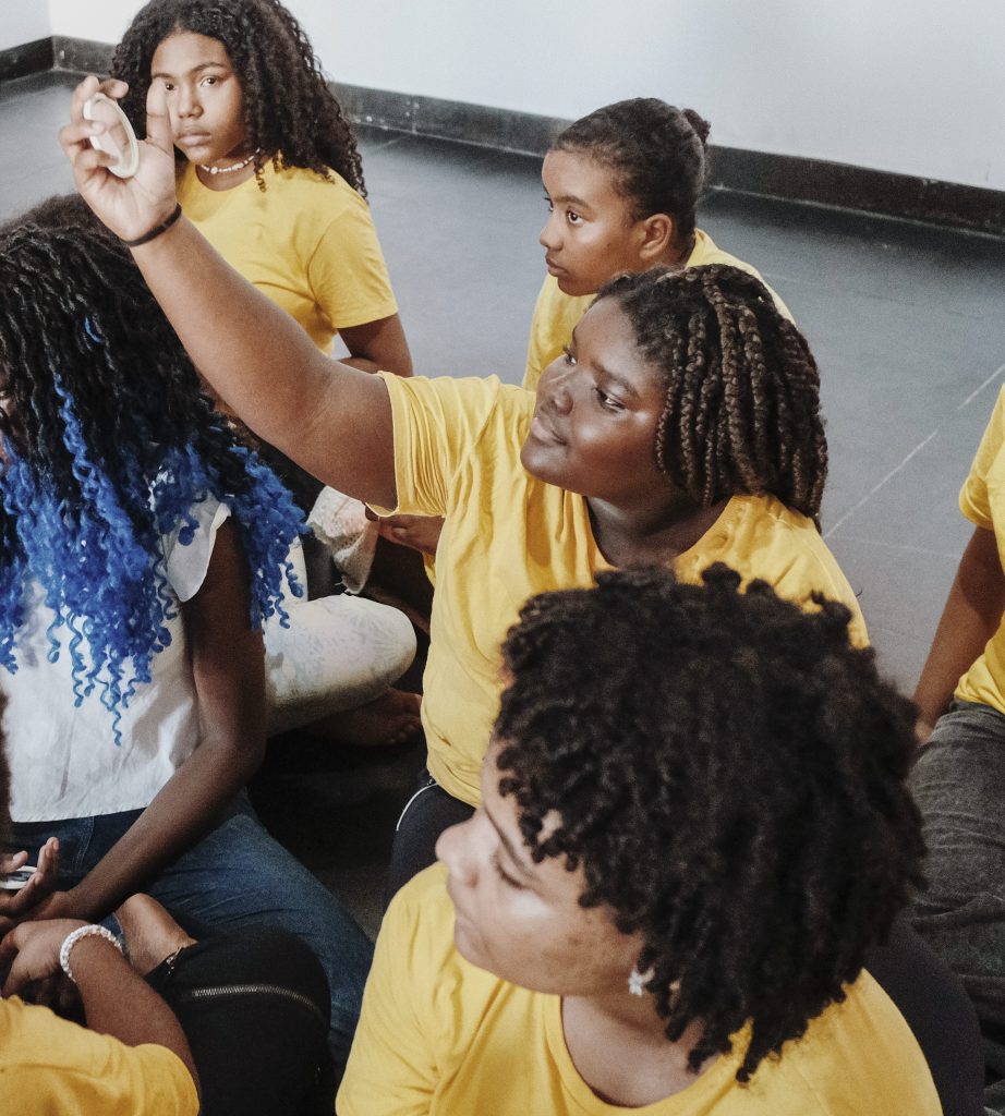
In a small village in Pwani, a district on Tanzania’s coast, a massive dance party is coming to a close. For the past two hours, locals have paraded through the village streets, singing and beating ngombe drums; now, in a large clearing, a woman named Sheilla motions for everyone to sit facing a large projector screen. A film premiere is about to begin.
It’s an unusual way to kick off a film about gender bias, inequality, early marriage, and other barriers that prevent girls from accessing education in Tanzania. But in Pwani and beyond, local organizations supported by Malala Fund and funded by Pura are finding creative, culturally relevant ways like this one to capture people’s interest.
The film ends and Sheilla, the Communications and Partnership Lead for Media for Development and Advocacy (MEDEA), stands in front of the crowd once again, asking the audience to reflect: What did you think about the film? How did it relate to your own experience? What can we learn?
Sheilla explains that, once the community sees the film, “It brings out conversations within themselves, reflective conversations.” The resonance and immediate action create a ripple effect of change.
MEDEA Screening Audience in Tanzania. Captured by James Roh for Pura
Across Tanzania, gender-based violence often forces adolescent girls out of the classroom. This and other barriers — including child marriage, poverty, conflict, and discrimination — prevent girls from completing their education around the world.
Sheilla and her team are using film and radio programs to address the challenges girls face in their communities. MEDEA’s ultimate goal is to affirm education as a fundamental right for everyone, and to ensure that every member of a community understands how girls’ education contributes to a stronger whole and how to be an ally for their sisters, daughters, granddaughters, friends, nieces, and girlfriends.
Sheilla’s story is one of many that inspired Heart on Fire, a new fragrance from the Pura x Malala Fund Collection that blends the warm, earthy spices of Tanzania with a playful, joyful twist. Here’s how Pura is using scent as a tool to connect the world and inspire action.
A partnership focused on local impact, on a global mission
Pura, a fragrance company that recognizes education as both freedom and a human right, has partnered with Malala Fund since 2022. In order to defend every girl’s right to access and complete 12 years of education, Malala Fund partners with local organizations in countries where the educational barriers are the greatest. They invest in locally-led solutions because they know that those who are closest to the problems are best equipped to solve and build durable solutions, like MEDEA, which works with communities to challenge discrimination against girls and change beliefs about their education.
But local initiatives can thrive and scale more powerfully with global support, which is why Pura is using their own superpower, the power of scent, to connect people around the world with the women and girls in these local communities.
The Pura x Malala Fund Collection incorporates ingredients naturally found in Tanzania, Nigeria, Pakistan, and Brazil: countries where Malala Fund operates to address systemic education barriers. Eight percent of net revenue from the Pura x Malala Fund Collection will be donated to Malala Fund directly, but beyond financial support, the Collection is also a love letter to each unique community, blending notes like lemon, jasmine, cedarwood, and clove to transport people, ignite their senses, and help them draw inspiration and hope from the global movement for girls’ education. Through scent, people can connect to the courage, joy, and tenacity of girls and local leaders, all while uniting in a shared commitment to education: the belief that supporting girls’ rights in one community benefits all of us, everywhere.
You’ve already met Sheilla. Now see how Naiara and Mama Habiba are building unique solutions to ensure every girl can learn freely and dare to dream.
Naiara Leite is reimagining what’s possible in Brazil
Julia with Odara in Brazil. Captured by Luisa Dorr for Pura
In Brazil, where pear trees and coconut plantations cover the Northeastern Coast, girls like ten-year-old Julia experience a different kind of educational barrier than girls in Tanzania. Too often, racial discrimination contributes to high dropout rates among Black, quilombola and Indigenous girls in the country.
“In the logic of Brazilian society, Black people don’t need to study,” says Naiara Leite, Executive Coordinator of Odara, a women-led organization and Malala Fund partner. Bahia, the state where Odara is based, was once one of the largest slave-receiving territories in the Americas, and because of that history, deeply-ingrained, anti-Black prejudice is still widespread. “Our role and the image constructed around us is one of manual labor,” Naiara says.
But education can change that. In 2020, with assistance from a Malala Fund grant, Odara launched its first initiative for improving school completion rates among Black, quilombola, and Indigenous girls: “Ayomidê Odara”. The young girls mentored under the program, including Julia, are known as the Ayomidês. And like the Pura x Malala Fund Collection’s Brazil: Breath of Courage scent, the Ayomidês are fierce, determined, and bursting with energy.
Ayomidês with Odara in Brazil. Captured by Luisa Dorr for Pura
Ayomidês take part in weekly educational sessions where they explore subjects like education and ethnic-racial relations. The girls are encouraged to find their own voices by producing Instagram lives, social media videos, and by participating in public panels. Already, the Ayomidês are rewriting the narrative on what’s possible for Afro-Brazilian girls to achieve. One of the earliest Ayomidês, a young woman named Debora, is now a communications intern. Another former Ayomidê, Francine, works at UNICEF, helping train the next generation of adolescent leaders. And Julia has already set her sights on becoming a math teacher or a model.
“These are generations of Black women who did not have access to a school,” Naiara says. “These are generations of Black women robbed daily of their dreams. And we’re telling them that they could be the generation in their family to write a new story.”
Mama Habiba is reframing the conversation in Nigeria
Centre for Girls' Education, Nigeria. Captured by James Roh for Pura
In Mama Habiba’s home country of Nigeria, the scents of starfruit, ylang ylang and pineapple, all incorporated into the Pura x Malala Collection’s “Nigeria: Hope for Tomorrow,” can be found throughout the vibrant markets. Like these native scents, Mama Habiba says that the Nigerian girls are also bright and passionate, but too often they are forced to leave school long before their potential fully blooms.
“Some of these schools are very far, and there is an issue of quality, too,” Mama Habiba says. “Most parents find out when their children are in school, the girls are not learning. So why allow them to continue?”
When girls drop out of secondary school, marriage is often the alternative. In Nigeria, one in three girls is married before the age of 18. When this happens, girls are unable to fulfill their potential, and their families and communities lose out on the social, health and economic benefits.
Completing secondary school delays marriage, and according to UNESCO, educated girls become women who raise healthier children, lift their families out of poverty and contribute to more peaceful, resilient communities.
Centre for Girls’ Education, Nigeria. Captured by James Roh for Pura
To encourage young girls to stay in school, the Centre for Girls’ Education, a nonprofit in Nigeria founded by Mama Habiba and supported by Malala Fund and Pura, has pioneered an initiative that’s similar to the Ayomidê workshops in Brazil: safe spaces. Here, girls meet regularly to learn literacy, numeracy, and other issues like reproductive health. These safe spaces also provide an opportunity for the girls to role-play and learn to advocate for themselves, develop their self-image, and practice conversations with others about their values, education being one of them. In safe spaces, Mama Habiba says, girls start to understand “who she is, and that she is a girl who has value. She has the right to negotiate with her parents on what she really feels or wants.”
“When girls are educated, they can unlock so many opportunities,” Mama Habiba says. “It will help the economy of the country. It will boost so many opportunities for the country. If they are given the opportunity, I think the sky is not the limit. It is the starting point for every girl.”
From parades, film screenings to safe spaces and educational programs, girls and local leaders are working hard to strengthen the quality, safety and accessibility of education and overcome systemic challenges. They are encouraging courageous behavior and reminding us all that education is freedom.
Experience the Pura x Malala Fund Collection here, and connect with the stories of real girls leading change across the globe.
Generation Z has its own slang that older generations, like Gen X and Millennials, have needed a literal translator to understand. However, thanks to social media, Gen Z’s slang has caught on in recent years.Most recently, a charming 77-year-old is using it to inspire younger generations to learn about art and art history. You may…
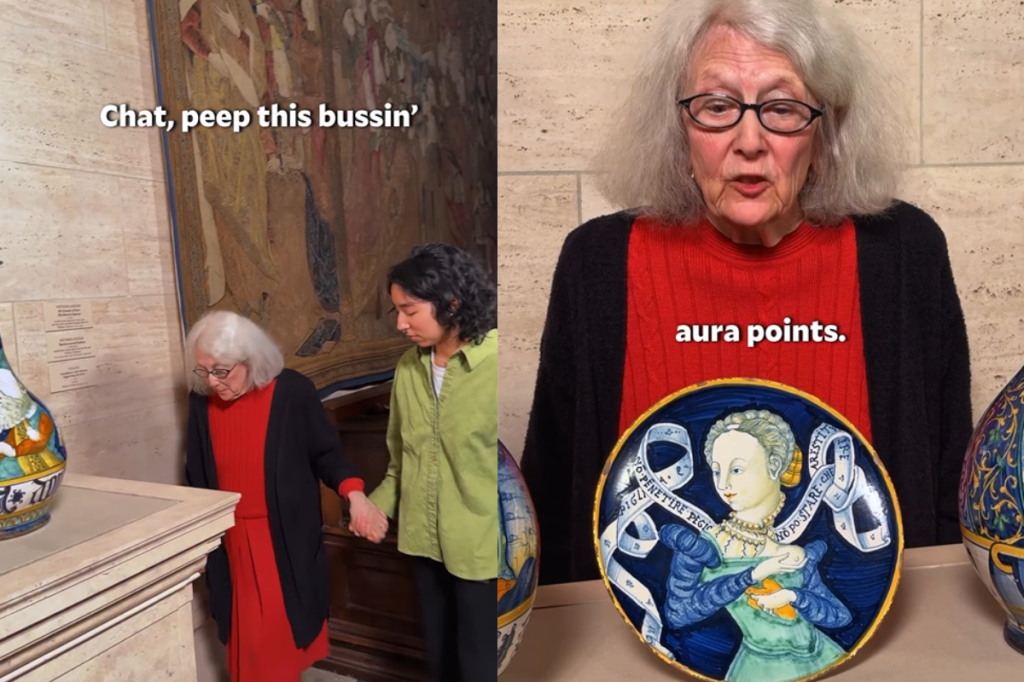
Most recently, a charming 77-year-old is using it to inspire younger generations to learn about art and art history. You may recognize Alison Luchs, curator of Early European Sculpture and deputy head of Sculpture and Decorative Arts at the National Gallery of Art in Washington, D.C., from your FYP (For You Page).
Her delightful art history videos are blowing up on social media where she has been showing off her apt use of Gen Z slang. Luchs introduces new pieces of art to viewers and describes them with quintessential Gen Z slang terms, like “bussin,’” “money maxxing,” and more.
In an interview with Good Morning America, Sydni Myers, the National Gallery of Art’s social media manager, explained that the museum wanted to hop on the Gen Z slang trend that other museums and libraries had been spoofing. She offered a funny explanation of how the videos came together with the collaboration of Gen Z and Millennial employees.
“A bunch of Gen Zers and Millennials just shouting out different words at each other,” Myers told Good Morning America.
As the idea gained traction, there was only one woman Myers wanted to star in the videos: Alison Luchs. Myers explained Luchs was “kind of a legend” at the museum and added that she has an “otherworldly cool presence.”
The museum dropped Luchs’ first iconic video on December 18, 2025. Immediately, it became a massive hit as she described the history of a clay dish by Orazio Pompei titled “Dish with an allegorical subject” to viewers.
“”Chat, peep this bussin’ clay dish from the 16th century,” she says in the video as she steps forward with some assistance from a National Gallery of Art intern. Luchs described the dish to viewers, noting, “Look how bro glazed it. He went goblin mode with all these colors. High key tough materials to work with. But he ate, and that glow still slaps 500 years later.”
Luchs told Good Morning America about the success of her viral social media videos.
A second video created by Luchs and the National Gallery of Art’s social media team was released on January 13, 2026, and it was another banger for the museum.
When asked what her favorite Gen Z slang term was of the ones she’s used, she replied, “My absolute favorite is ‘the glow still slaps after 500 years.’ That should be a motto for our collection, at least the collections I work with.”
While the museum plans to release more content with Luchs, viewers react
Viewers absolutely adore Luchs, and she has seen the heartfelt comments from them. “I have [seen the comments] and they’re wonderful. They’re so touching,” Luchs told Good Morning America.
Here’s what they had to say:
“We don’t see any crumbs on that dish. That must mean she ate. 💅”
“I’m so incredibly impressed, both by the plate and her delivery.”
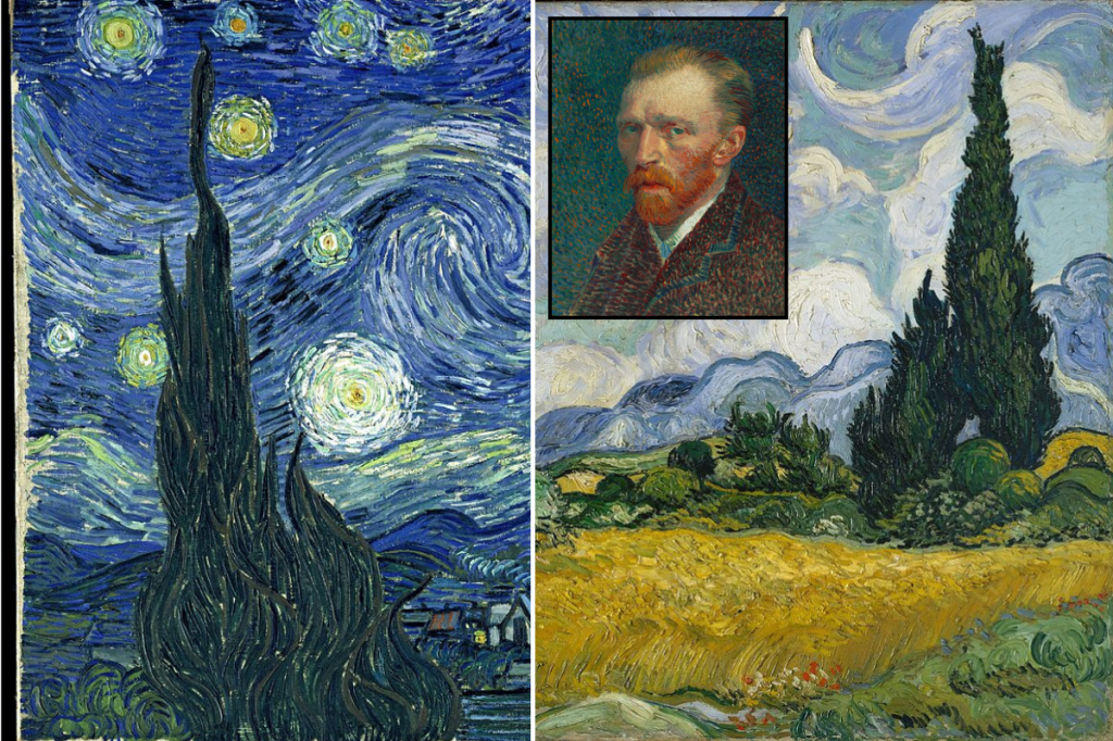
The famous view from "The Starry Night" was painted by Vincent van Gogh many times in lesser-known works. – Photo credit: Public domain/Wikimedia Commons
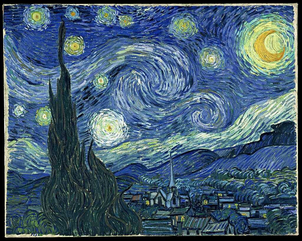
Vincent van Gogh’s The Starry Night is widely considered one of the most renowned paintings of all time, often uttered in the same breath as The Mona Lisa and The Last Supper by Leonardo da Vinci, as well as Edvard Munch’s The Scream, among many others.
It has been discussed at length in both art history and pop culture, yet there are still plenty of mysteries for the casual fan to uncover about this incredible work of art.
The Starry Night was painted while van Gogh was voluntarily staying at the asylum of Saint-Paul-de-Mausole in Saint-Rémy-de-Provence, France. He checked himself in shortly after cutting off part of his own ear in late 1888 and famously painting his iconic Self-Portrait with Bandaged Ear. He continued to experience mental health challenges after the incident and sought help in May 1889.
The Starry Night is van Gogh’s interpretation of the view from his room at the asylum. The Van Gogh Gallery notes, “Van Gogh lived well in the hospital; he was allowed more freedoms than any of the other patients. If attended, he could leave the hospital grounds; he was allowed to paint, read, and withdraw into his own room. He was even given a studio.”
He lived there for about a year and created countless works. Fascinatingly, he painted variations of the same view many times over in works that would go on to achieve only a fraction of The Starry Night’s fame.
Here are five lesser-known van Gogh paintings from nearly the same perspective as The Starry Night:
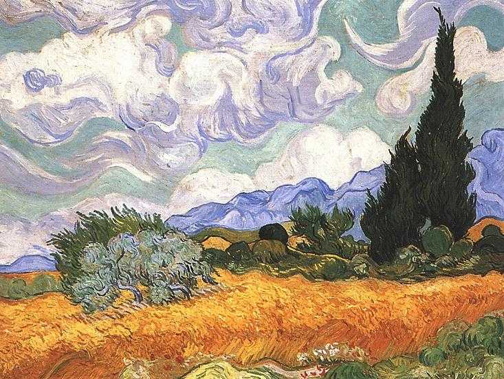
1. Wheat Field with Cypresses (September 1889)
Wheat Field with Cypresses was painted several months after van Gogh completed The Starry Night. The two works closely resemble one another, from the unique shapes of the cypress trees to the contours of the mountain range and the swirling clouds. Notably, this piece is painted in a much lighter palette than the darker tones van Gogh used earlier that summer, which the Van Gogh Gallery links to his struggles with mental health at the time. An earlier version of Wheat Field with Cypresses was darker than the September version.
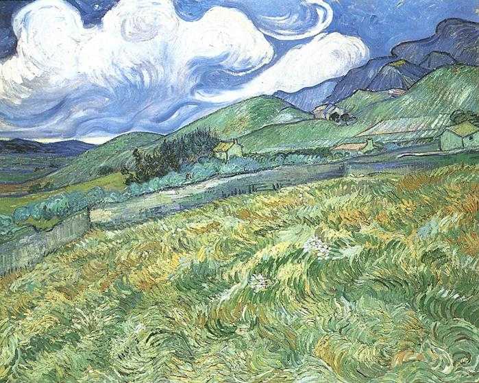
Mountainous Landscape Behind Saint-Paul Hospital is a precursor to The Starry Night, predating it by an unknown amount of time. The view, however, is nearly identical. The central rolling hill, which gives way to the oddly shaped mountain ridge, is a dead ringer for how the landscape appears in van Gogh’s most famous work.
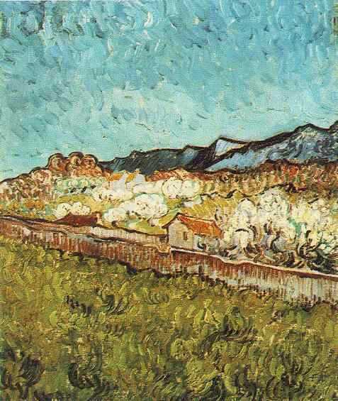
3. At the Foot of the Mountains (June 1889)
This painting was completed shortly before van Gogh began The Starry Night and offers a slightly different perspective. The sky is relatively cloudless, but the mountains are as distinctive as ever. The same, or a very similar, small cottage at the center of the painting shows up repeatedly in van Gogh’s works from Saint-Rémy.
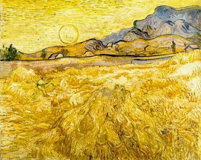
4. Wheat Field with Reaper and Sun (June 1889)
Here’s a similar scene done closer to sunrise, casting a golden hue over the familiar landscape. Van Gogh would go on to paint the same reaper several more times. During this period, he repeatedly created studies of the same scenes and revisited them from multiple angles.
5. Olive Trees with the Alpilles in the Background (June 1889)
What’s fascinating about this one, besides showing an alternative perspective on the view from The Starry Night, is that it represents one of van Gogh’s greatest achievements. In a letter to his brother, the artist admitted that he found olive trees “too beautiful for me to dare paint.”
At the asylum, he had plenty of time on his hands and finally worked up the courage to give it a try.
“The olive trees are very characteristic, and I’m struggling to capture that,” he wrote. “It’s silver, sometimes more blue, sometimes greenish, bronzed, whitening on ground that is yellow, pink, purplish or orangeish to dull red ochre. But very difficult, very difficult.”
Seeing van Gogh’s many attempts and perspectives during his stay at the asylum, and how his techniques and use of color evolved over time, is fascinating and adds texture and meaning to The Starry Night.
It’s no wonder art lovers continue to make pilgrimages to Saint-Rémy to take in the views for themselves. Visitors can even tour van Gogh’s room and look out the very same window on a guided visit. While some of the scenery has changed, the landscape is very much the same. It really gives you a whole new appreciation for how he captured the magic of the mountains and sky and created something that continues to move people more than 125 years later.
What makes poetry poetry? There are certain technical elements that a poem might include, like rhyme and meter, but plenty of poetry doesn’t follow any structural rules.
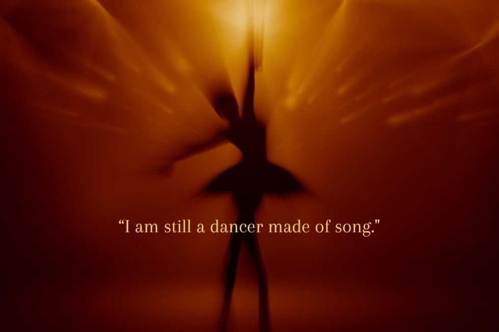
Perhaps the best definition of poetry comes from Emily Dickinson, who wrote, “If I feel physically as if the top of my head were taken off, I know that is poetry.” A good poem hits you in your brain, your heart, and your gut all at once. And one short poem that packs an incredibly moving punch has come from an unlikely source—an elderly woman with dementia.
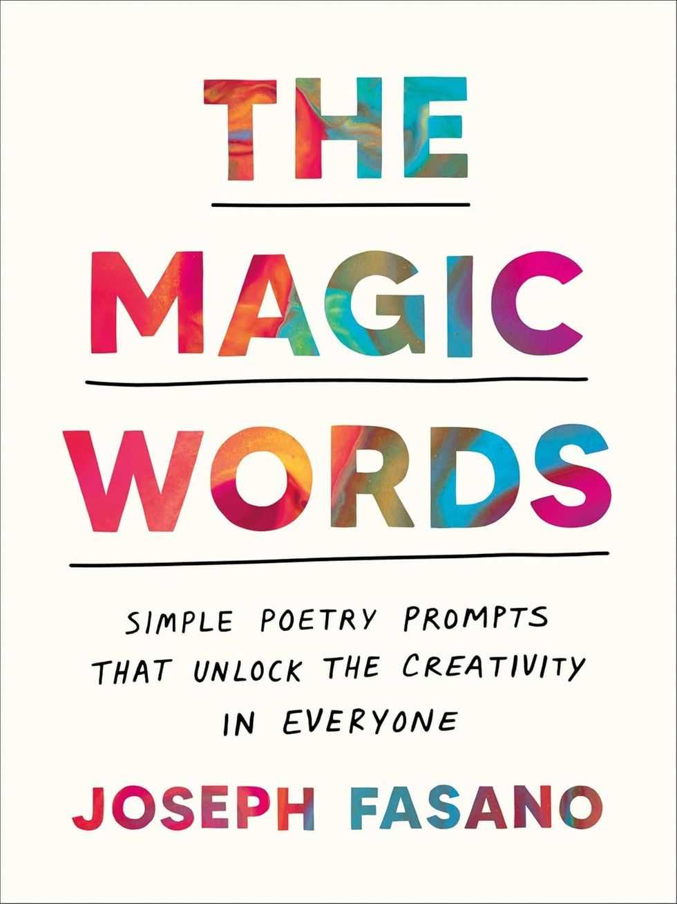
Poet Joseph Fasano shared a message from a fan who shared that they used one of Fasano’s poetry prompts with their mother, a 92-year-old former ballet dancer living with dementia. The mother was excited to write a poem, and they slowly worked through the prompt together aloud.
Wow. What a testament to the power of poetry to reach beyond our usual modes of communication, which dementia so cruelly disrupts. In a few simple lines, we’re able to see this woman as she might see herself, as the human living under the veils of age and disease: “I am still a dancer made of song.”
Poetry prompts can help people express themselves in ways they otherwise couldn’t
In the book’s introduction, Fasano shares that he’d been invited to speak to a class of second graders in New Jersey in 2022 to share “the craft and magic of poetry.” As part of his efforts, he came up with a poetry prompt that could “help guide their imaginations” and “unlock the images, thoughts and feelings inside them, without asking them to worry about how to structure a poem.” He called the results “astonishing.” When he shared one of the students’ poems on social media, it and the prompt took off like wildfire, as people who never thought of themselves as poets felt empowered to share their imaginations within that framework.
From 7-year-olds to 92-year-olds, anyone can benefit from the self-expression that poetry facilitates, but many people feel hesitant or intimidated by the idea of writing a poem. Fasano writes, “Poetry is what happens when we let ourselves be,” and this idea seems so clear in the former dancer’s poem above. Dementia can create roadblocks, but poetry provides a different avenue of communication.
The arts can be a powerful tool for people with dementia
Using poetry to help dementia patients communicate and express themselves isn’t just wishful thinking. Studies have demonstrated that cultural arts interventions, including poetry specifically, can be beneficial for people with dementia. In fact, the Alzheimer’s Poetry Project (APP) aims to use poetry as a means of improving the quality of life of people living with dementia by facilitating creative expression. “We do not set boundaries in our beliefs in what possible for people with memory impairment to create,” the APP website states. “By saying to people with dementia, we value you and your creativity; we are saying we value all members of our community.”
Poet Gary Glazner founded APP and shared a story with WXPR radio about how he came up with the idea while studying poetry at Sonoma State University:
“I applied for a grant and got a grant to work at an adult care program. The moment I love to share with people is there was a guy in the group, head down, not participating and I said the Longfellow poem. ‘I shot an arrow into the air’ and his eyes popped open and he said, ‘It fell to earth I know not where.’ And suddenly he was with us and participating. It was just this powerful moment to see how poetry could be of use to elders but specifically with people with dementia.”
Caregivers try many different ways to communicate with people living with dementia. Photo credit: Canva
Another initiative, Arts 4 Dementia, does poetry workshops with people in early stages of dementia.
“‘Poetry allows freedom of expression and can add warmth and depth to what may start as prose,” Arts 4 Dementia CEO Nigel Franklin told the Alzheimer’s Society. “Through poetry, participants access certain images or memories from their lives, and build these fragments together. Older people living with dementia often learnt poems off by heart as a child, and many of these poems are still accessible. Our participants have early-stage dementia, so while short-term memory may be diminished, many skills can be retained. They are welcome to read poetry (at their own pace) or ask their companion to read and perhaps write what they have created. We give participants time to answer—we don’t answer for them—and above all, we show respect and we’re never patronising.”
Whether we read it, write it, speak it, or hear it, poetry has the power to reach people of all ages and stages of life in all kinds of mysterious ways.
Our love for the ocean runs deep. Does yours? Enter here!
This Valentine’s Day, we’re bringing back our favorite giveaway with Ocean Wise. You have the chance to win the ultimate ocean-friendly date. Our recommendation? Celebrate love for all your people this Valentine’s Day! Treat your mom friends to a relaxing spa trip, take your best friend to an incredible concert, or enjoy a beach adventure with your sibling! Whether you’re savoring a romantic seafood dinner or enjoying a movie night in, your next date could be on us!
Here’s how to enter:
Go to upworthy.com/oceandate and complete the quick form for a chance to win – it’s as easy as that.
P.S. If you follow @oceanwise or donate after entering, you’ll get extra entries!
She’s up before the sun and still going at bedtime. She’s the calendar keeper, the lunch packer, the one who remembers everything so no one else has to. Moms are always creating magic for us. This Valentine’s Day, we’re all in for her. Win an eco-friendly spa day near you, plus a stash of All In snack bars—because she deserves a treat that’s as real as she is. Good for her, kinder to the ocean. That’s the kind of love we can all get behind.
Special thanks to our friends at All In who are all in on helping moms!
Grab your favorite person and get some much-needed ocean time. Did you know research on “blue spaces” suggests that being near water is linked with better mental health and well-being, including feeling calmer and less stressed? We’ll treat you to a beach adventure like a surfing or sailing class, plus ocean-friendly bags from GOT Bag and blankets from Sand Cloud so your day by the water feels good for you and a little gentler on the ocean too.
Special thanks to our friends at GOT Bag. They make saving the ocean look stylish and fun!
Love nights in as much as you love a date night out? We’ve got you. Have friends over for a movie night or make it a cozy night in with your favorite person. You’ll get a Disney+ and Hulu subscription so you can watch Nat Geo ocean content, plus a curated list of ocean-friendly documentaries and a movie-night basket of snacks. Easy, comfy, and you’ll probably come out of it loving the ocean even more.
Soak up the sun and catch a full weekend of live music at BeachLife Festival in Redondo Beach, May 1–3, 2026, featuring Duran Duran, The Offspring, James Taylor and His All-Star Band, The Chainsmokers, My Morning Jacket, Slightly Stoopid, and Sheryl Crow. The perfect date to bring your favorite person on!
We also love that BeachLife puts real energy into protecting the coastline it’s built on by spotlighting ocean and beach-focused nonprofit partners and hosting community events like beach cleanups.
Date includes two (2) three-day GA tickets. Does not include accommodation, travel, or flights.
Stay in and cook something delicious with someone you love. We’ll hook you up with sustainable seafood ingredients and some additional goodies for a dinner for two, so you can eat well and feel good knowing your meal supports healthier oceans and more responsible fishing.
Giveaway ends 2/15/26 at 11:59pm PT. Winners will be selected at random and contacted via email from the Upworthy. No purchase necessary. Open to residents of the U.S. and specific Canadian provinces that have reached age of majority in their state/province/territory of residence at the time. Please see terms and conditions for specific instructions. Giveaway not affiliated with Instagram. More details at upworthy.com/oceandate
Our love for the ocean runs deep. Does yours? Enter here!
This Valentine’s Day, we’re teaming up with Ocean Wise to give you the chance to win the ultimate ocean-friendly date. Whether you’re savoring a romantic seafood dinner, catching waves with surf lessons, or grooving to a concert by the beach, your next date could be on us!
Here’s how to enter:
Go to ocean.org/date and complete the quick form for a chance to win – it’s as easy as that.
P.s. If you follow @oceanwise or donate after entering, you’ll get extra entries!
Here are the incredible dates:
1. Staycation + Surf Lesson
Hang ten on the ultimate ocean date! Whether you’re beginners or seasoned surfers, a cozy stay by the ocean and surf lessons will have you riding the waves and making unforgettable memories together.
2. A Year of Netflix
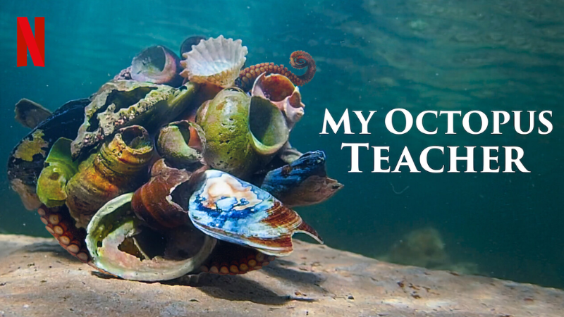
Get cozy and explore the wonders of the ocean right from your couch! Whether you’re diving into breathtaking documentaries or finally watching My Octopus Teacher, enjoy a full year of streaming on us.
3. BeachLife Festival Tickets
Soak up the sun and enjoy Lenny Kravitz, Sublime, Alanis Morissette, and more at BeachLife Festival May 2-4, 2025. Celebrate your love for music and sea at the LA’s Premier Beach Music Festival!
4. Private Cooking Lesson with Michelin-starred Chef
Learn how to make a delicious meal with Matthew Kammerer who has earned a Michelin green star due to his commitment to sustainability in addition to two Michelin stars for his restaurant – Harbor House Inn.
5. Dinner for Two at Wrench and Rodent
Sustainable seafood isn’t just delicious, it’s an excellent way to combat overfishing. Enjoy dinner for two at the incredible Wrench and Rodent, courtesy of Chef Davin Waite in San Diego, California. Wow your date with both a delicious meal and the knowledge you’re supporting a healthy, thriving ocean!
Giveaway ends 2/11/25 at 11:59pm PT. Winners will be selected at random and contacted via email from the Upworthy. No purchase necessary. Open to residents of the U.S. and specific Canadian provinces that have reached age of majority in their state/province/territory of residence at the time. Please see terms and conditions for specific instructions. Giveaway not affiliated with Instagram. More details at ocean.org/date
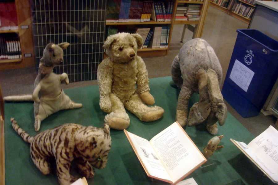
The real-life Christopher Robin accepted a tiny payment from Disney that's still changing lives. – Photo credit: Marcus Adams National Portrait Gallery (1928)/Wikimedia Commons
Christopher Robin Milne was thrilled to be a character in his father’s popular book when he was six, but once he reached the age of 10, things took a turn. The young Milne wanted to be seen as separate from the imaginative little boy in the book, but the world wouldn’t let him, which led to deep resentment. His complicated relationship with the chubby little cubby fueled his estrangement from his famous father and resulted in him not wanting the royalties later in life.
The estrangement with his family ran deep, extending far beyond his father for decades. According to a recent interview on Nostalgia Tonight, Gyles Brandreth, a friend of the late Christopher Robin, explains that the younger Milne’s perception began to change about being immortalized in a children’s book after he went to boarding school.
“Then, when he went away to boarding school people began to tease him. He was Christopher Robin, and then when he joined the army and after the Army and after University, and he was in his life, trying to get a job. He would go to interviews and people would say, ‘Oh, your name’s Milne. Are you by any chance related to the famous writer?’ or ‘Your initials are CRM. You must be Christopher Robin. How’s Winnie the Pooh?’ and that infuriated him,” Brandreth told Nostalgia Tonight. “He got to the stage where he really couldn’t stand it. And in fact, he accused his father of building his reputation by standing on a small boy’s shoulders. And the father and son eventually fell out. And there, the family became a divided family.”
Christopher Robin’s relationship became more strained with his parents when he decided to marry his first cousin, Lesley de Selincourt. While the two didn’t know each other before dating, as their families were estranged, it still prompted intense criticism and more of a rift. The couple left London to live in the country away from everyone else, including the overshadowing presence of an imaginary bear obsessed with honey.
The young couple had no interest in the elder Milne’s money from the books, so when A.A. Milne died in 1956, Christopher Robin wanted nothing to do with Pooh Properties Trust set up by his father. Christopher Robin managed the trust and was one of the original five recipients. While he handled all of the royalties, he didn’t use any of it, including after Disney began paying royalties into the trust after acquiring licensing rights from Stephen Slesinger Inc., the company of an American literary agent Milne signed with. Slesinger purchased the merchandising rights for $1,000 in 1930. By 1961, nearly 10 years after Slessinger died, his wife sold the rights to Disney.
The animation giant agreed to pay a portion of royalties to Stephen Slesinger Inc., while still paying royalties to Pooh Properties Trust. Pooh Properties didn’t sell the literary rights to Disney at the time, though Christopher Robin’s relationship with the bear remained complicated. All while dealing with business around the trust he didn’t want, the younger Milne and his wife were caring for their daughter, who was born with cerebral palsy. In 1980, the reluctant heir sold a portion of the estate to create a separate trust to care for his daughter, Clare.
In 2001, Pooh Properties Trust agreed to sell the literary rights to Disney for $350 million. Though Christopher Robin sold his portion of the estate and no longer received royalties from Disney, the portion he set aside for Clare continues to provide today. The Clare Milne Trust supports people living with disabilities by providing charities that serve disabled individuals who live in Devon and Cornwall, England.
One of the toughest things about being a parent has to be helping your child discover and nurture their talents. You seek to encourage them to try new things without overwhelming them. You want them busy with lots of enriching activities but not so busy they don’t have time to just be a kid. And when you do stumble on something they have a knack for, you tread lightly, wanting to give them every opportunity to pursue it without pushing too hard.
It’s a really tricky balance to get right. Maybe that’s why we’re so fascinated with child prodigies, or even just talented kids whose parents have done a bang-up job of giving them the space and encouragement to explore their creativity.
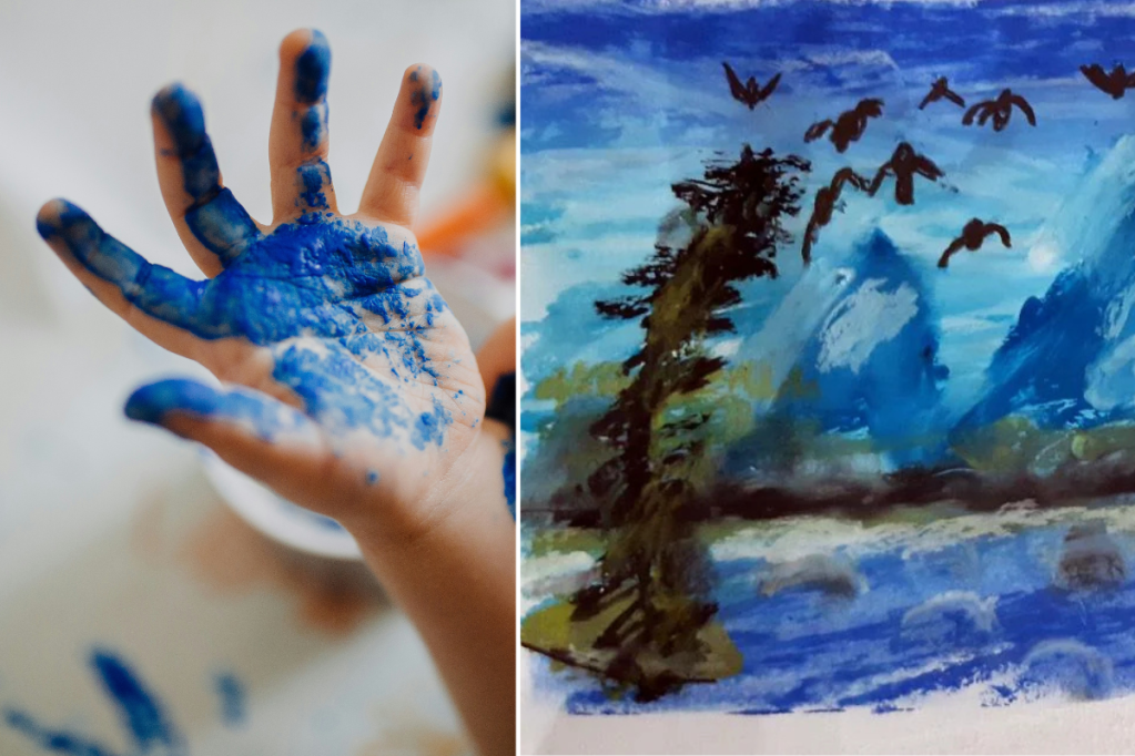
Joseph, a dad from Dublin, Ireland says he started drawing and painting in the evenings about a year ago to help him unwind from work. It’s a great idea, because adult coloring has been shown to have a ton of positive mental health effects. Plus, it’s fun! But one unintended and adorable side effect of Joseph’s coloring was that his young son, Philip, decided he wanted to emulate him.
Philip had always loved coloring but, Joseph says, “I had to get him some pastels, and he started trying on the same drawings as I did,” Joseph says. “I found it absolutely adorable when he was seriously repeating the same movements as me: cleaning the tips of the pastels, blend the edges of colors, etc.”
One thing quickly became apparent: Philip was much, much better than his old man.
Last year, he made a painting that was so good he couldn’t resist sharing it on Reddit. Within two days, it generated over 100,000 views and 3000 likes.”
The overwhelming response? “Uh, 5-year-olds can’t do that.”
Have a look and see for yourself. Not bad, eh?
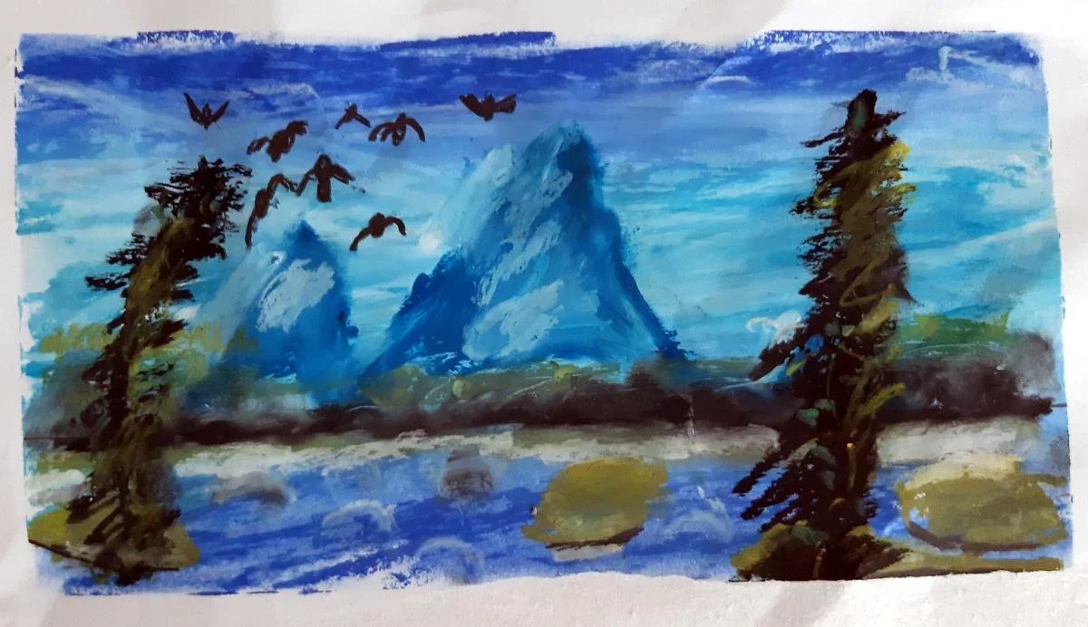
Philip painted this blue mountain lake piece with help from a YouTube tutorial. bruncvik/reddit
The first piece Philip shared is wildly impressive. Some commenters couldn’t believe that a 5-year-old could have made it, but I think you can see it pretty clearly. It has just enough childlike crudeness, but the stylistic flair is just off the charts, from the whispy sky to the slightly foreboding trees. Redditors agreed that it was incredible.
“Thats better than I can do now at 25,” one Reddit user wrote.
Others questioned whether the boy might be related to Bob Ross.
“I told [Philip] about it, and I guess that was his first big dopamine hit,” Joseph says of going viral. “Since then, he is asking to draw more often, and there’s often an intrinsic reward for him. One painting got submitted to a charity auction at his school … I don’t pressure him to draw; he’s coming to me to ask whether he can use my pastels”
One critical part of the story is that Philip often follows along with YouTube videos that his dad finds for him. Lest you think this should diminish how impressive the painting is, quite the contrary. As someone with an almost-5-year-old of my own, I’ve seen the kind of stuff kids this age are capable of drawing — and it’s not this! No matter how much instruction they have.
The structured YouTube videos were able to unlock Philip’s natural talent and guide him in a way that his dad never could.
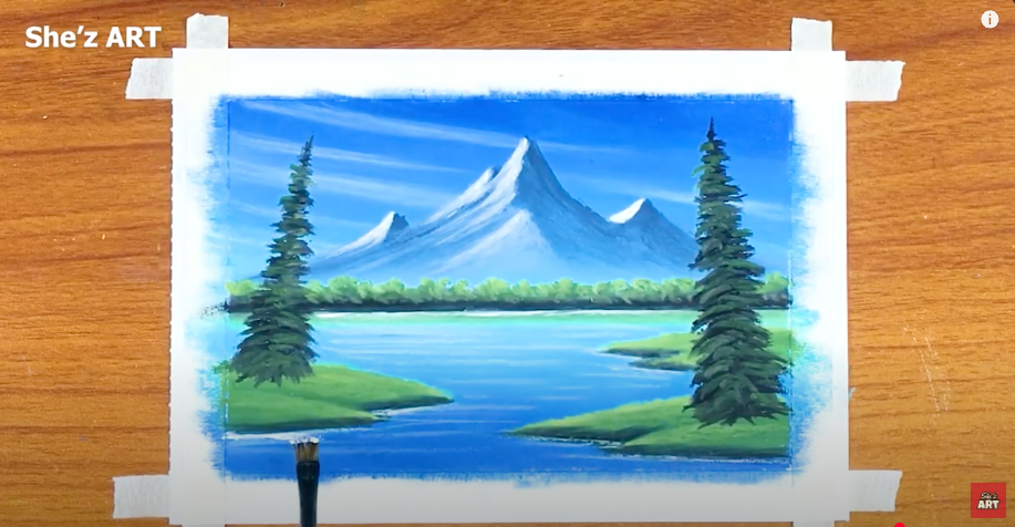
Here’s the finished painting he was following along with. Honestly? I like Philip’s better! It has a lot more personality.
Here's what the painting was She'z ART/YouTube
The response to Philip’s first painting was so positive that his dad decided to post another piece.
You gotta give the people what they want!
I love this one, too. The youngster’s talent is on display again, with an excellent color palette and aggressive strokes giving it life. Remember — the kid is five years old! Five! Usually they can barely muster a convincing stick figure.
I love this haunting purple and orange piece Philip painted! bruncvik/reddit
And again, here’s the model painting from YouTube. Joseph said his own versions of these paint-alongs come out looking a lot like the example, but that his son has an incredible way of making them his own.
As you might expect from a 5-year-old, the brush strokes are a little more crude and dramatic — but they’re purposeful, as well! Philip’s renditions have a lot of energy and seem to leap off the page.
But what do I know? I’m no art critic. However, the huge social media response definitely shows that Philip is onto something here.
A YouTube tutorial of a sunset river helped Philip learn to paint the scene. She'z ART/YouTube
Philip’s dad gives a lot of thought to the right way to nurture his son’s talent without pushing too hard and snuffing it out.
“He attended an afterschool art club, where they experimented with different media, but he found it too restrictive. He is still bringing home new art at least twice per week, but it’s something he does on his own,” dad says, not sure if pushing his son into formal art instruction is the right thing to do.
Experts say that pushing too hard when your kid shows a flair for something, especially regarding longterm goals (like going to art school or becoming a professional artist one day), can backfire big time and make them feel overwhelmed and resentful.
Believe it or not, the process of nurturing and teaching starts super early. Art teachers and experts agree that how you react to something as simple as your toddler’s nonsensical scribbles can have a big impact on their self-esteem and enjoyment of making art.
Heidi Hass Gable, a former gifted child, says in a TedX talk that prodigies and brilliantly talented children can be extremely sensitive.
They often have to suppress their talents in a desire to fit in with all the other kids. That makes raising them and nurturing that talent a delicate high-wire act. Experts recommend making sure gifted kids get lots of downtime and to not place too much emphasis on achievements like grades, awards, contest wins, etc. Praise the hard work and the process but try to help them avoid attaching their self-worth to external validation.
Joseph finds lots of subtle ways to encourage his son’s interest.
“One thing I do with him, though, is to talk about painting when we are out and about. Last weekend, we went to watch the sunset, and I asked him what colors he’d use for the clouds. … Philip is just as obsessed with different shades (his current favorite word is ‘vermilion’ and his favorite color is ‘turquoise’), and how they mix.”
Being the parent of a talented or gifted kid is no easy job. There are a lot of pitfalls and plenty of ways to bungle your attempts to nurture that talent. As impressive as Philip’s artwork is, especially for his age, the thoughtful parenting on display in this story is just as awesome.
This article originally appeared in January. It has been updated.
The reason many people who posed for those portraits were as white as bleached cotton sheets is multifaceted. Portraits from the Victorian era generally depict wealthy people, which is likely the reason for the over-the-top dresses and hairstyles. Sitting for a formal portrait was an expensive luxury that poor people couldn’t afford. If they had been able to, we’d probably see a lot more color in the faces being captured.
In the 1800s, especially during the European Victorian era, paleness indicated status. The paler you were, the more money you were assumed to have, signaling higher social status. It was believed that tan skin meant you did some form of outdoor manual labor, something associated with poorer people. Paintings from that era often show women enjoying the outdoors in multilayered dresses, carrying parasols to shield their fair skin from the sun. This belief that paleness displayed high status became a dangerous obsession, according to historians.
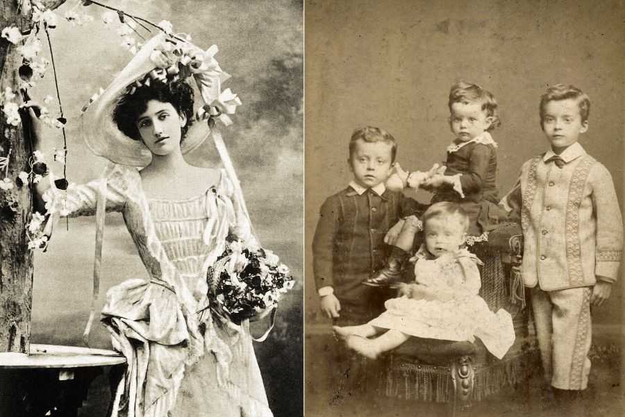
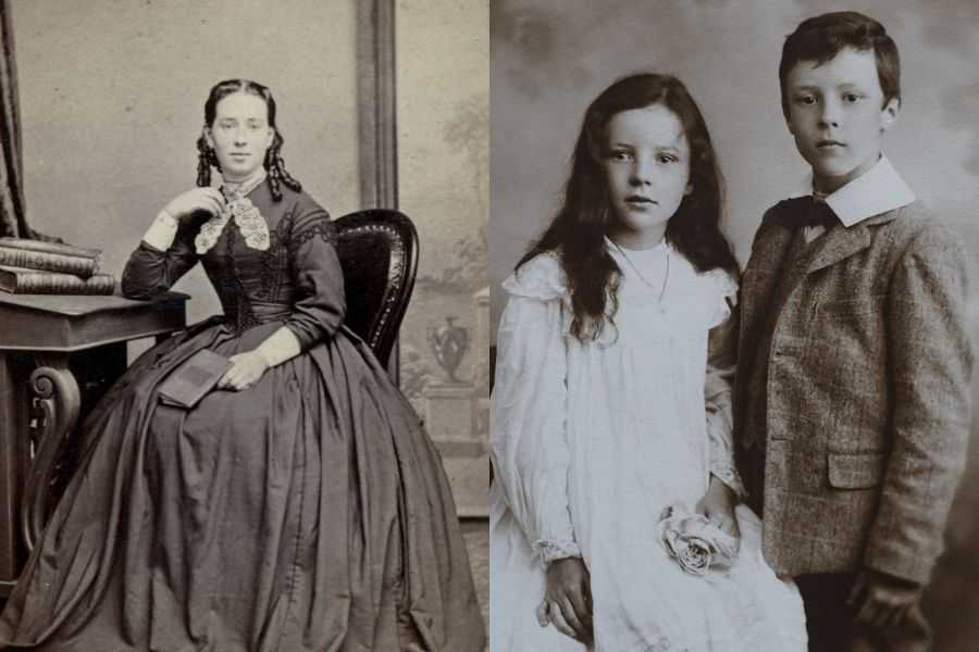
Vintage portraits of a woman and two children, showcasing elegant attire of their era. Photo credit: Canva
The Johnston Collection explains that the Romantic period marked a shift toward paleness and extreme thinness as the ultimate signs of wealth and beauty, writing, “many of the beauty icons of the day were depicted as skeletal thin with ghostly pale skin, glistening eyes, flushed cheeks and perpetually red lips.” Those chasing this impossible beauty standard quickly noticed that contracting tuberculosis produced many of these highly sought-after features as the disease progressed.
“If a lady wasn’t fortunate enough to suffer from such a glamorous illness, she could feign going into a decline – the desirable fragile look being simulated by drinking vinegar and dropping belladonna into the eyes,” The Johnston Collection notes.
Belladonna is poisonous, but women of the era appeared unafraid to risk death for the privilege of being seen as beautiful. As the Romantic period faded, appearing sickly did not fall out of fashion. The Victorian era simply tied paleness to morality and social status, leading women to continue risking their lives to avoid being perceived as poor. Instead of trying to contract tuberculosis, women began ingesting arsenic, chalk, and even ground-up rocks to maintain a fair complexion.
“In 1851, a Swiss physician published a report in a medical journal about the ‘toxicophagi,’ a group of people in modern-day Austria who routinely consumed arsenic; they knew it was poison, but thought they could develop an immunity to it by starting with small doses and gradually increasing the intake. The report’s author claimed that arsenic gave them great energy, sparkling eyes, and wonderful complexions, but noted that after long-term use, unsurprisingly, ‘most arsenic eaters end with an inevitable infirmity of the body.’”
While there was some knowledge that consuming arsenic could be dangerous, it was still viewed as benign when used in other products. The chemical was used to create the color green in clothing, wallpaper, and other products. This led children to take on the same sickly look and eventually contributed to their deaths. Unintentionally, entire families were poisoned by their beautiful green wallpaper, dresses, baby blankets, and other household items.
It took one family losing multiple children to what doctors believed was diphtheria before a leading physician and a chemist teamed up to uncover why the children kept dying. After noticing the green wallpaper in the home, the doctor asked to perform an autopsy on the child who had recently died. The results of the tests changed how society treated the dangerous chemical.
If you ever find yourself gazing up at a portrait of a ghostly pale Victorian child or a wealthy Victorian woman, you’ll know that arsenic is likely the reason. Ingesting deadly chemicals to keep up appearances is a practice that should probably stay lost to history.


