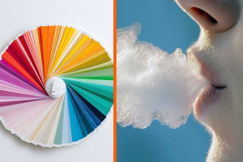
Every year since 1999, the Pantone Color Institute has announced its “Color of the Year,” and it often gets people talking. Whether people agree or disagree, love it or hate it, it’s an interesting way to look at trends and, more excitingly, to predict what’s coming next. From Mocha Mousse (2025) to Peach Fuzz (2024) to Ultra Violet (2018), the choices often send interior designers and their clients into fun frenzies that shake up the design conversation and make many of us see color differently.
Well, it’s that time again. Pantone has chosen its next “Color of the Year” for 2026, and it’s (drumroll, please)… “Cloud Dancer.” What’s that you say? According to the Pantone team, PANTONE 11-4202 Cloud Dancer is “a lofty white that serves as a symbol of calming influence in a society rediscovering the value of quiet reflection. A billowy white imbued with serenity.”
In an interview, Laurie Pressman, vice president of the Pantone Color Institute, explained how the selection process works.
“To arrive at the selection each year, this global team of color experts at the Pantone Color Institute comb the world looking for new color influences,” Pressman said. “This can include the entertainment industry and films in production, traveling art collections and new artists, fashion, all areas of design, aspirational travel destinations, etc.”
They take color trends very seriously, and have for decades. Pressman continues:
“Founded in 1985, the Pantone Color Institute educates, inspires, and promotes fluency in the language of color. Executive Director Leatrice Eiseman, who helped to start the Pantone Color Institute, has a background in color, design, and psychology. The ongoing color preference study research which she conducts through the Pantone Color Institute serves as the foundation for who we are and all that we do.”
Many people online vehemently disagree. In a Reddit thread titled “Thoughts on Pantone’s Colour of the Year 2026,” commenters dive in right away. Many compare the idea of something “billowy white” to a straitjacket. “Sir, please don’t put me in this straitjacket,” one person wrote. “But ma’am! This jacket is Pantone’s 2026 color of the year!!”
Others shared the colors they prefer, such as rust oranges and deep blues. One commenter noted that IKEA makes a similar announcement, which many people seem to like better: “IKEA has a color of the year too: rebel pink.”
Others offered harsher takes on the chosen Pantone color, or what some believe is a lack thereof: “Landlord Special, Padded cell, Hospital Chic, The Comic Sans of colours.”
Another jokes, “Things are getting heated in the color fandom.” Indeed they are. So much so that on Threads, one post went viral after a user going by the name @historical.anachronism pushed back against the “experts” and chose their own color instead. “I don’t give a s–t what Pantone says, my color of the year is Phthalo Green.”
In just two weeks, the post has racked up more than 36,000 likes and nearly 1,000 comments. Many people seem to agree. One commenter wrote, “As someone who works as a florist, this color, deep burgundy, and walnut have been trending hard. You’re right. This probably should have been CotY.”
Another writes, “Colour of the year? This is the colour of my life!”
On an inspirational note, a Threader adds, “As an artist, phthalo green feels good on my brain.”
Many compare it to the hunter green that was popular in the ’90s, but the OP notes that phthalo green is slightly different. Think Frankenstein, many suggest, when trying to conjure the deep green in your mind. (In fact, perhaps think about the transcendent green that director Guillermo del Toro splashes into most frames of his films.)
Connelly Goods shares on its site that the vibrant green color began production in 1938, “quickly gaining popularity for its rich, velvety hue, which some artists have even described as the most significant advance in artist pigments since the discovery of synthetic Ultramarine Blue in 1826.” They also add this fun fact: “One of the most famous artists to use Phthalo Green was Jackson Pollock, who incorporated it into his painting ‘Alchemy.’ Pollock’s use of the pigment contributed to the vibrant and dynamic nature of his signature drip style.”
In a follow-up thread, @thebooksatchel asks, “How did everyone unanimously come up with phthalo green for color of the year as opposed to Pantone’s choice? is there a back story I do not know about? (Love the color)”
Many offer their theories, but perhaps, at least for some, this Threads user said it best: “My theory is humanity is growing tired of colorless life. We’re missing nature and I think consciously or subconsciously we as a whole crave more color and joy and less of this lifeless hell-scape that is the current modern era. I think as a whole we crave the rich hues that the earth has to offer us.”