Who doesn't love a good idiom? An idiom, for the uninitiated, is a common saying that means something different than the literal words might suggest. For example, "Don't look a gift horse in the mouth," has nothing to do with horses and refers to the fact that you should be grateful and not critical of something someone has given you for free.
Idioms are weird, funny, catchy, and have an incredible ability to convey a lot of meaning in a small number of words. They often have strange or unique origins and evolve over time as they become a key part of the cultural lexicon.
 "Working like a dog," is a popular idiom, even though dogs are notoriously lazy. Giphy
Sadly, not all idioms are made to last. Some of the oldest ones get phased over time as their meanings are lost, and new ones get adopted by the masses. A lot of our most famous idioms come from old English times, but newer ones like "Drink the Kool-Aid," "Jumping the shark," or even "Thanks, Obama" originated in the last few decades. (Admittedly, the line between idiom and meme is getting extremely thin).
For new idioms to arise, some old ones have to go. A research study carried out by Perspectus Global recently identified idioms that may be in danger of falling out of the English language very soon. The group asked 2,000 people aged 18 to 50 whether they used any of a list of fifty expressions.
Here are some of the best idioms that most people no longer use. Humbly, I'm begging you all to reconsider.
 Please don't let these idioms die out, I'm begging you! Giphy
1. A few sandwiches short of a picnic
This one is used to refer to someone who's not very intelligent. A little like "The lights are on, but no one's home," or "Not the sharpest tool in the shed."
It's origin is relatively recent, but it just hasn't caught on; probably because it's a little mean. Fifty-three percent of respondents said they don't use the phrase and, honestly, that's a shame because I think this is a slightly nicer alternative to some of the other "stupid" idioms, and it's always fun to think about sandwiches.
2. Colder than a witch's tit
Part idiom, part simile, this one is definitely on its way out. Seventy-one percent said they don't use the phrase, which makes sense because it's a little sexist and vulgar. Not to mention, it originates from the days of the Salem Witch Trials, a time we don't remember fondly.
This one could still work in the right circumstances, though—say, on a frosty Halloween evening. "It's cold as balls," another common and vulgar idiom, is getting tired and stale. This one could be worth rotating in every now and then.
3. Know your onions
 Know your onions Photo by mayu ken on Unsplash
World Wide Words writes, "It was one of a set of such phrases, all with the sense of knowing one’s stuff, or being highly knowledgeable in a particular field, that circulated in the 1920s. Others were to know one’s oats, to know one’s oil, to know one’s apples, to know one’s eggs, and even to know one’s sweet potatoes."
Sixty-eight percent of people don't use this idiom, which means it's highly endangered. I, however, think it's catchy enough that it deserves to hang around a little longer.
4. A nod is as good as a wink
In full, this idiom was originally "A nod is as good as a wink to a blind horse." It's a catchy turn of phrase that indicates that a subtle suggestion or hint has been understood and that there's no need to elaborate or over-explain.
It's an old one, originating from the 1700s, but it's still useful, in my opinion, and I know more than a few people who are prone to over-explaining when a simple "nod" would do.
5. A stitch in time saves nine
Another one from the 1700s, this idiom is used as advice to deal with problems straight on and right away.
Metro UK writes, "It’s believed to have had its origins in sewing, the idea being that if you mend a small tear with one stitch, it will prevent it from becoming a bigger tear which might need more stitches–nine, in fact–to repair."
Sixty-four precent of respondents don't use this idiom anymore, but maybe they should. It rhymes and the advice is solid; that much will never go out of style.
6. I've dropped a clanger
You use this one when you've made a big or embarrassing mistake. I'd never heard of it before, but when I read it I immediately started laughing out loud.
That's a good enough reason that more than just 40% of the population should be using it regularly.
7. A fly in the ointment
 A fly in the ointment Photo by VD Photography on Unsplash
Referring to an unexpected annoyance that ruins a good thing, I remember this idiom from when I was a kid. Apparently, though, it's rapidly fading from the lexicon. Fifty-nine percent say they never use it, even though it comes to us all the way from the Bible.
It was probably the inspiration for Alanis Morissette's lyric, "A black fly in your chardonnay."
8. A flash in the pan
Another one I remember from my childhood, "a flash in the pan" is still barely hanging around. It's often used to describe the equivalent of a musical one-hit wonder, i.e. someone or something that's here one day and gone the next with little cultural impact.
I always thought it had to do with cooking, like a quick burst of flame when you add oil to a hot pan, but it actually refers to 17th century muskets and gunpowder exploding. Mental Floss writes, "Sometimes, the fire wouldn’t carry on to the powder in the barrel, and a “flash” in the gun’s pan had no effect. Therefore, a flash in the pan with no projectile was much ado about nothing."
9. Storm in a teacup
Over half of people surveyed either don't use this idiom or aren't familiar with it, which really is a shame. This turn of phrase is honestly adorable and visceral!
Sometimes called "tempest in a teapot," this one means "an exaggerated uproar over a minor or trivial matter" according to Grammarist. It comes all the way from the Roman philosopher Cicero who once used the phrase "storm in a ladle." I think we can agree that teacup is cuter.
10. Dead as a doornail
I used to hear people say this one all the time, but if you pressed me now, I'd be hard-pressed to remember the last time I heard it used. The survey backs that up, with 55% of people saying they never use the expression.
The idiom was famously used in Charles Dickens' A Christmas Carol, and according to Upworthy writer Annie Reneau, "Way back when, nails were made by hand and quite valuable. People would salvage and repurpose nails whenever they could. The way doornails were bent and driven into the backside of a door made it virtually impossible for them to be reused as a nail. ...So not only are doornails dead simply because they're nails, but because their future potential for any other use is also dead. They are doubly dead, if you will. Extra deceased."
Now that I know where it comes from, I find myself wanting to bring it back!
11. Not enough room to swing a cat
Talk about idioms you can see. This one is extremely visceral, and refers to a small space without much room to, well, you get the idea.
This is a great example of how idioms evolve over time. The "cat" in the phrase actually doesn't refer to swinging a live cat by its tail, but it's a reference to a "cat o' nine tails" whip. Dictionary.com writes, "This expression, first recorded in 1771, is thought to allude to the cat-o'-nine-tails, or 'cat,' a whip with nine lashes widely used to punish offenders in the British military."
12. Popped her clogs
We've needed a fresh death idiom for a while now. "Kicked the bucket" is so played out. "Popped her clogs," is only used by less than half of the population, making it ripe for a comeback.
Grammarist takes a shot at the origin of this strange phrase: "To work in a factory, one had to wear clogs to protect his or her feet. It was also common in those days to pawn things to help tide you over to the next payday. Another word for pawn was pop. Then there is a stretch made in the story. If you were going to die, you wouldn’t need your clogs anymore, so you would pop them. ...Though, if you were going to die, why would you need more money?"
13. Steal my thunder
 Steal my thunder Photo by Leon Contreras on Unsplash
I still use this all the time, but I must be in the minority, because the research shows that over half of all people never say it.
The origin of "steal my thunder" is fascinating and weird. The story goes that a playwright by the name of John Dennis invented a machine in 1709 to use in one of his shows—the machine could create a noise that sounded exactly like a clap of thunder. Well, his play sucked and was quickly replaced by a run of Macbeth. The new production wound up using his thunder machine without permission, prompting him to proclaim, “They will not let my play run, but they steal my thunder!“
14. Cool as a cucumber
 Cool as a cucumber Photo by Mockup Graphics on Unsplash
Now I'm not a big cucumber fan, but in researching these idioms I did learn that cucumbers, due to their high water content, can stay six to seven degrees cooler than the outside temperature. That makes them an extremely refreshing choice on a hot day.
Overall, I still prefer "cooler than the other side of the pillow," but the cucumber idiom is less wordy and has some fun alliteration. It deserves to be in regular circulation, but unfortunately, the data shows it's dying out.
15. See a man about a dog
Ever heard someone say this before excusing themselves to go to the bathroom? Mensa explains it: "The phrase ‘to see a man about a dog’ is an old but fairly common expression that appeared in English in the late 19th century. It is a wry excuse or mild fib declared with a wink: 'I am going out and do not want to tell you where I am going.'"
The origin is a little complicated and goes back to the days of dog racing, prohibition, and more. Sometimes it's "see a man about a horse."
In any case, I think clever quips you can use before leaving the room are always good to have in your back pocket, so this is your reminder to hold onto this one.


 "Working like a dog," is a popular idiom, even though dogs are notoriously lazy.
  Please don't let these idioms die out, I'm begging you!
 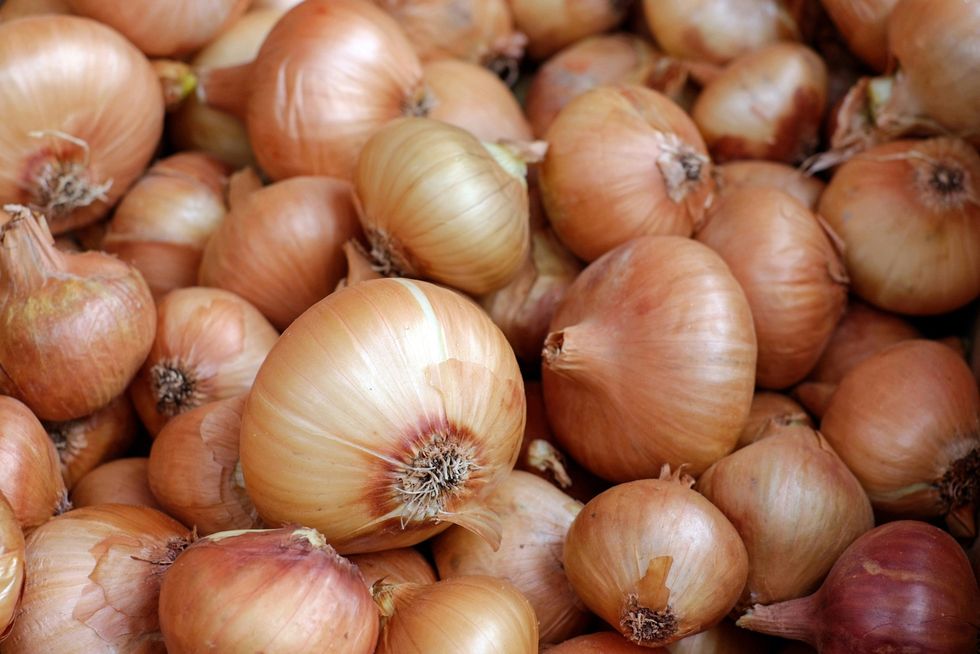 Know your onions Photo by
  A fly in the ointment Photo by
  Steal my thunder Photo by
 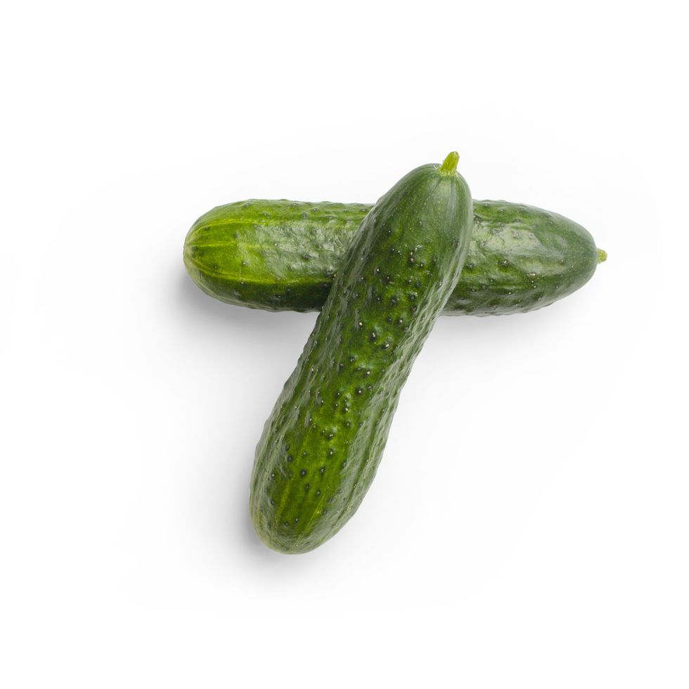 Cool as a cucumber Photo by
  "I think I love my mom the most."
  “I think it’s time to go. I hope my mom will be okay."
  That way a piece of them stays with you forever.

 A woman struggles with insomniaImage via Canva
 A woman struggles with insomniaImage via Canva