You might know people who fall in the black part of the first graph. Maybe you could show this to them?
Tags
More for You


Education
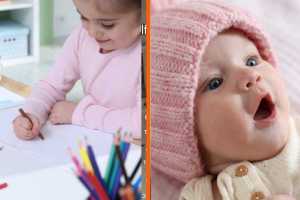
1st grade teacher asked students to color their ‘favorite’ hat. She then secretly created each one for real.

Get stories worth sharing delivered to your inbox.
Advertisement