Heroes
The Good News: We Know What The Problem Is. The Bad News: WTF?
I don’t understand how this statistic came to be. But it certainly explains a lot. Imagine what we could get done if the first chart matched the second one.
07.26.13


Facebook is critical to our success and we could use your help. It will only take a few clicks on your device. But it would mean the world to us.
Here’s the link . Once there, hit the Follow button. Hit the Follow button again and choose Favorites. That’s it!

If you’d like to know why this is so important for us, you can read more about it here .
Van Gogh's Starry Night, 1889.
Vincent van Gogh never got to enjoy his own historic success as an artist (even though we've been able to imagine what that moment might have looked like). Van Gogh died in 1890 at the age of 37 in Auvers-sur-Oise, France after shooting himself in the chest with a revolver. It was a tragic end to a turbulent life marked by mental instability and severe self-doubt.
According to the Van Gogh Museum, in a letter to his brother Theo in 1890, just a couple of weeks before his death, Van Gogh wrote, "...my life, is attacked at the very root, my step also is faltering." The man was struggling and exhausted. The high standards he had set for himself and his art were taking a toll. He was unsure about his future and, up to this point, had not received much recognition for his work and thought himself a failure "as a man and as an artist."
His most well-known work, Starry Night, was famously painted while Van Gogh was staying in an asylum in France 1889 after he mutilated his ear during a psychotic episode. According to the Van Gogh Museum, though, this may not be the full story. While it is widely agreed that Van Gogh did in fact cut off his own ear, the museum notes that it was because of a fight between Van Gogh and Paul Gaugin, the artist he had been working for in Aries, that led to the violent explosion that highlighted his deteriorating mental state.
 Vincent Van Gogh's Self-Portrait, 1889Image via Canva.
As one of the best known and most studied artists of the 19th century, Van Gogh's madness and how it influenced his work is not new information. But it turns out that those of us who have appreciated his work have been missing out on some critical details for more than 100 years—revealed in the 2010s thanks to the Hubble Space Telescope.
We known Van Gogh was an artist—and a genius artist at that—but, it turns out, he was also scientist. Kind of.
Whether intentionally or not, fresh eyes have found that Van Gogh's art—aside from being breathtaking—also captures one of science and nature's most elusive concepts: Turbulence.
The concept of turbulence is hard to understand with math, but it turns out art makes it fairly easy to comprehend through depiction. So, what is turbulence?
According to Britannica, turbulence, or turbulent flow, is a concept of fluid dynamics in which a type of fluid flow (liquid or gas like air or water or air) undergoes an irregular fluctuation or energy cascade. In other words, the air or water swirls and eddies as it moves: big eddies make smaller eddies, and those make even smaller ones, and so on. Common examples of turbulent flow include blood flow in arteries, lava flow, atmosphere and ocean currents, and the flow in boat wakes or surrounding the tips of aircraft wings.
It looks like this:
 Turbulent flow illustrated and animated.All Van Gogh GIFs via TED-Ed.
The thing is, scientists only started figuring this out pretty recently.
 Animation of art referencing science.All Van Gogh GIFs via TED-Ed.
And yet, there was Mr. Vincent van Gogh, 100 years earlier in his asylum with a mutilated ear and able to accurately capture this turbulent flow in what would become his most famous work, Starry Night.
 Animated Starry NightAll Van Gogh GIFs via TED-Ed.
The folks who noticed Van Gogh's ability to capture turbulence checked to see whether other artists did the same. Most of the Impressionists achieved "luminance" with their art—a striking and lifelike depiction of light's effect on color. While impressive, they did not capture or depict turbulence the way Van Gogh did.
 An animated depiction of The Scream.All Van Gogh GIFs via TED-Ed.
Not even Edvard Munch's The Scream, with it's swirling color and movement, could recreate what Van Gogh had accomplished.
Who would have thought that the beauty Van Gogh captured was foreshadowing what scientists would observe in the real, natural world in a century's time? To learn even more, watch the TED-Ed video below:
- YouTubeyoutu.be
This article originally appeared twelve years ago. It has been updated.
Robert Irwin's answer to who would win in a fight between 100 men and 1 gorilla settles the debate.
In 2020, a viral debate was launched on social media prompted by an intriguing question: Who would win in a fight between 100 men and 1 silverback gorilla? In the years since, the question has been reposed repeatedly, with people expressing diverse but vehement opinions about whether a gorilla is strong enough to take on 100 humans or whether the sheer number of people would be enough to overtake the powerful primate.
Silly question? Perhaps. Something people can't help weighing in on? Most definitely.
@cbsmornings Could 100 men defeat one gorilla in a fight? #NateBurleson and the internet are on the case. #gorilla
Some might think the most prudent answer would be, "It depends. What size are the people, and what's their strategy for attacking or subduing the gorilla?" But Robert Irwin, the conservationist son of the late (and much beloved) wildlife expert Steve Irwin, actually provided a perfect answer that should end the debate once and for all.
Irwin took to TikTok to share that he's been asked the "Who would win in a fight between 100 humans and 1 gorilla?" question over and over recently, even having people stop him on the street to ask.
"I have a couple thoughts on this," he began. "First of all, I don't know. Gorillas are strong, mate. Like really strong. But it's a hundred people. I'm not sure." But, he said, as an animal conservationist, the entire idea of fighting an endangered species didn't sit right with him. Then he turned the question on its head.
"How many people does it take to save gorillas?" he asked. "That's the question we should be asking because there's not many of them left."
@robertirwin Everyone here on TikTok keeps asking me about this viral ‘Human V Gorilla’ debate 😂 I'm finally weighing in on the discussion everyone is talking about.
He explained that yes, gorillas are super strong and powerful, but most of the time "they're pretty chill." A gorilla isn't going to just randomly pick a fight with 100 people. Unless they feel threatened and need to defend themselves, they're just going to go about doing their thing, as gorillas do. "I guess what I'm trying to say is we don't need to fight gorillas," concluded Irwin. "Maybe let's just let this one remain a mystery."
People loved Irwin's take and the way he turned the question on its head from fighting gorillas to saving them.
"This is real masculinity. Lover not a fighter."
"Him gentle parenting us like school children is sending me."
 gorilla hurrying GIFGiphy
"The main man has spoken. The debate is over."
"He really said, 'it’s never HOW is the gorilla.'"
"'How many people does it take to save gorillas' is the most Robert Irwin answer."
"Your dad would be proud ❤️ spoken like a true conservationist ❤️."
Robert Irwin has followed in his father's footsteps and become an environmental icon in his own right, with fans from all over the world following his passionate educational content about our planet's creatures. Many in the comments remarked that they didn't know that gorillas were endangered, but it's true. All species of gorilla are considered Endangered or Critically Endangered, according to Endangered Species International.
There are two main species of gorilla, the eastern and western gorilla, and the World Wildlife Fund reports that both species have been decreasing in number for decades. However, the mountain gorilla subspecies is the sole exception, with numbers on the rise thanks to concerted conservation efforts. Mountain gorillas were officially downgraded from Critically Endangered to Endangered in November 2018, a genuine conservation success story.
However, there are still only around 1,000 mountain gorillas in the world today, so that turnaround in numbers is a fragile success. And other species still need our help to save them from further demise.
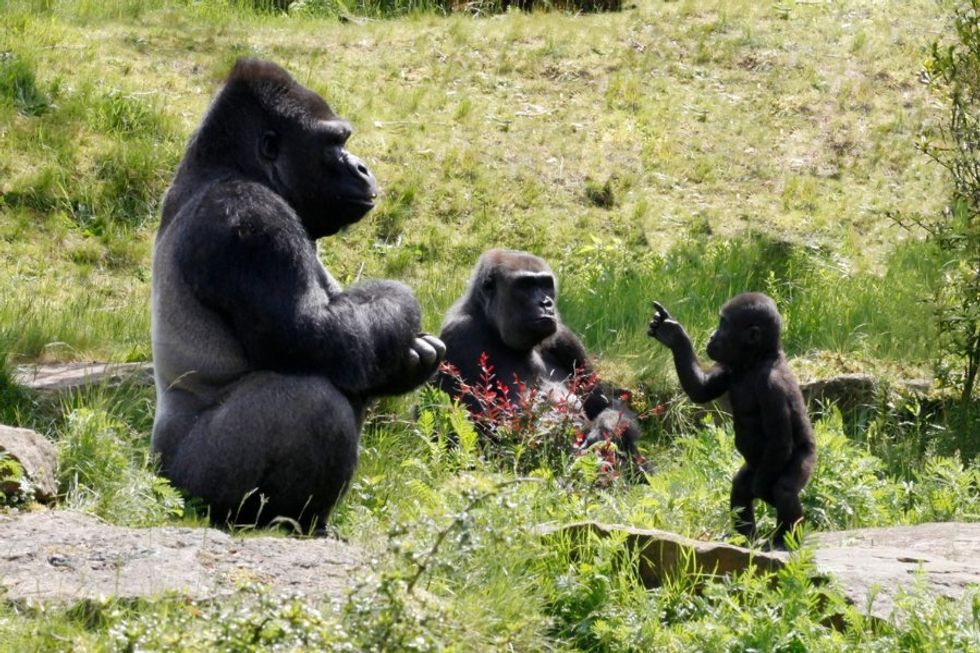 Gorillas are generally pretty chill.Photo credit: Canva
The Dian Fossey Gorilla Fund has been working on saving gorillas for over 55 years, focusing on a holistic approach that includes gorilla protection and ecosystem preservation, scientific research, training the next generation of conservationists, and helping local communities near gorilla populations. You can learn more here.
Thank you, Robert Irwin, for the gentle and timely reminder of what really matters in the gorilla vs. humans debate.
Saying "I love you!" by accident is one of life's most cringe moments.
For many of us, telling our friends and family that we love them is second nature. Every time someone leaves the house, "Love you!" Before bed at night, "Love you!" Getting off a call with them, "Love you!"
That's all well and good until that sweetly ingrained habit spills over into your work life. Especially when you're talking to an important client, where the boundaries of professional conduct are particularly important to uphold. (Do you feel the cringe coming?)
 I Love You Elf GIF by MOODMANGiphy
A woman shared an oh-so-human story about absent-mindedly telling a client she loved him, and his thoughtful response has people cheering.
"Accidentally said 'Love you!' at the end of a call with an important client yesterday," wrote a Reddit user. "I heard him giggle as I hung up, and I was mortified. Today, I saw he emailed me this:"
from MadeMeSmile
The email began, "Hey—Just wanted to say that I didn't mean to laugh at you when you accidentally signed off on our call with a 'love you.' I just found it funny because I've definitely done that before, and I know it happens."
Okay, phew, he understood that the laughing was mortifying and he wasn't bothered by the "love you." But then he added the absolute best thing he could have said about the situation:
"I'm glad you have enough love in your life that that response comes naturally. If anything, you should be proud of that. :)"
Then he mercifully resumed their professional conversation. "Have a great weekend! We'll follow up about my call with Chris on Wednesday, as discussed."
 "Love you!" Oops.Photo credit: Canva
He didn't just ignore the elephant in the room and let it hang over her like an awkward cloud. He put her at ease, letting her know he's done it before and it happens and is no big deal. But then he took it a step further, adding a deeper human layer to the moment by acknowledging the fact that the words flowing so automatically and easily for her meant she was surrounded by love.
The client's emotional intelligence and thoughtful response warmed people's hearts.
"What a great and respectful response. He is completely right, it’s such a beautiful thing to have that much love in your life that it comes out naturally."
"You work with good people."
"Honestly, this made my day 😂 It's so wholesome how they responded. Shows that a little kindness (even accidental) always leaves a good impression!"
"Such a classy response. Made you feel at ease while staying professional and moving the conversation forward."
"Green flags from that client."
 Green Flag GIF by The Last Talk ShowGiphy
People also shared their own similar experiences with blurting out accidental "love you"s and it was a veritable love-fest:
"I told my supervisor I loved her at the end of our weekly touch point call - she chuckled and said she loved me too. We shared a good laugh. I am happy to see empathy from a random human, it is much needed."
"I said 'love you' to my new boss at labcorp when she called me to tell me I passed my drug test. Same thing, hanging up, not thinking, she gave me my results and my start date to come in for orientation and I ended the call with 'bye love you!'"
"Back in the day I straight up called one of my bosses mom. It was so embarrassing I almost died."
"A surprising number of people have done this at least once. Happens when you’re distracted and tired. My ex husband (a prosecutor) accidentally ended a phone call with 'I love you' when talking to a rural county sheriff in the middle of the night."
 Embarrassed Hide GIF by florGiphy
"I had a coworker say 'love you,' just as we were about to hang up. There was an awkward pause, clearly neither of us had hung up, then he added, 'Don’t tell my wife.' We both laughed and finally disconnected."
"I did that with my ex husband last Thursday, we both burst out laughing lol. Happily we get along great and he and his fiancée are attending my wedding next week."
"Was on phone with my boss right after he had called his wife. He ended the call with "love you." Had so much fun telling him that while I cared for him, I didn't think it was love."
Embarrassing moments don't have to ruin your day—in fact, when handled like this client, they can turn into beautiful moments of human connection. This kind of relatability, empathy, and emotional intelligence makes us all feel better about our shared humanity, oopsies and all.
A crying baby.
The names we give to our children can be very personal. They can reflect religious beliefs, family heritage, or have a special meaning attached to them, as in Grace, which means "divine favor," or Eli, which means "ascended." In the United States, people they are protected by the Constitution's First Amendment, freedom of speech, which allows us to name our babies whatever we like.
However, there have been some cases where the courts decided that a particular name is illegal, and, although it is infrequent, it has happened at least 10 times in the country. The most notable banned names are Misteri N-Word, King, Queen, Jesus Christ, III, Santa Claus, Majesty, Adolf Hitler, @, and 1069.
 A court reporter taking notes.via Canva/Photos
Thomas Boyd Ritchie III was known by many of his friends simply as III. So, he petitioned the court to have his name changed to Roman numerals. Sadly, a California court rejected the name change because it was a symbol and a number. It’s illegal for people to have numbers in their names because they can’t be entered into state name databases.
In the California Superior Court case Lee v. Superior Court (1992), Russell Lawrence Lee wanted to change his name to Misteri (N-word). Lee believed that the name could be used to conquer racial hatred. Unfortunately for Lee, the court denied his request, saying the name constituted “fighting words.”
The address symbol, or @, has been banned in multiple jurisdictions because, like a numeral, it cannot be input into state database records.
The name of the Christian lord and savior has been banned in several U.S. states based on claims of blasphemy and the possibility of confusion.
 Depiction of Jesus Christ in Heaven.via Canva/Photos
In 1976, the North Dakota Supreme Court told high school teacher Michael Herbert Dengler that he could not change his name to “1069.” “The only way [my] identity can be expressed is 1069. The first character, 1, stands for my concept of nature which manifests itself as one individual among the various forms of life,” he noted. “I stand as a single entity amongst millions of other entities, animate and inanimate. But yet even though I am an entity unto myself, I am part of the whole of life which is one. I am one; life is one; and together we are one.”
He later moved to Minnesota and tried to change his name, but he was rejected again. Neither state allowed people to have numbers as their names.
In December 1999, Robert William Handley of Ohio filed a petition to change his name to Santa Rob Claus, because he had played the Christmas character for the past 40 years, and was known as “Santa Rob” year-round. The court rejected his petition, saying it was “misleading to the children of the community.” Two years later, the Supreme Court of Utah allowed the name change.
 A photo of Santa Claus.via Canva/Photos
In several states, naming your child after a royal title is illegal to avoid confusion with actual royalty. Does Queen Latifah know this?
If you want to name your child Adolf Hitler, you can’t do it in Texas. After the atrocities he committed in the 1930s and ‘40s, his name has no place in the Lone Star State. However, you can be named Adolf Hitler in New Jersey. Back in 2009, there was a big hubbub when the father of Adolf Hitler Campbell wanted his child’s name written on a birthday cake, and the proprietor of the business refused.