For many of us, telling our friends and family that we love them is second nature. Every time someone leaves the house, "Love you!" Before bed at night, "Love you!" Getting off a call with them, "Love you!"
That's all well and good until that sweetly ingrained habit spills over into your work life. Especially when you're talking to an important client, where the boundaries of professional conduct are particularly important to uphold. (Do you feel the cringe coming?)
 I Love You Elf GIF by MOODMANGiphy
A woman shared an oh-so-human story about absent-mindedly telling a client she loved him, and his thoughtful response has people cheering.
"Accidentally said 'Love you!' at the end of a call with an important client yesterday," wrote a Reddit user. "I heard him giggle as I hung up, and I was mortified. Today, I saw he emailed me this:"
The email began, "Hey—Just wanted to say that I didn't mean to laugh at you when you accidentally signed off on our call with a 'love you.' I just found it funny because I've definitely done that before, and I know it happens."
Okay, phew, he understood that the laughing was mortifying and he wasn't bothered by the "love you." But then he added the absolute best thing he could have said about the situation:
"I'm glad you have enough love in your life that that response comes naturally. If anything, you should be proud of that. :)"
Then he mercifully resumed their professional conversation. "Have a great weekend! We'll follow up about my call with Chris on Wednesday, as discussed."
 "Love you!" Oops.Photo credit: Canva
He didn't just ignore the elephant in the room and let it hang over her like an awkward cloud. He put her at ease, letting her know he's done it before and it happens and is no big deal. But then he took it a step further, adding a deeper human layer to the moment by acknowledging the fact that the words flowing so automatically and easily for her meant she was surrounded by love.
The client's emotional intelligence and thoughtful response warmed people's hearts.
"What a great and respectful response. He is completely right, it’s such a beautiful thing to have that much love in your life that it comes out naturally."
"You work with good people."
"Honestly, this made my day 😂 It's so wholesome how they responded. Shows that a little kindness (even accidental) always leaves a good impression!"
"Such a classy response. Made you feel at ease while staying professional and moving the conversation forward."
"Green flags from that client."
 Green Flag GIF by The Last Talk ShowGiphy
People also shared their own similar experiences with blurting out accidental "love you"s and it was a veritable love-fest:
"I told my supervisor I loved her at the end of our weekly touch point call - she chuckled and said she loved me too. We shared a good laugh. I am happy to see empathy from a random human, it is much needed."
"I said 'love you' to my new boss at labcorp when she called me to tell me I passed my drug test. Same thing, hanging up, not thinking, she gave me my results and my start date to come in for orientation and I ended the call with 'bye love you!'"
"Back in the day I straight up called one of my bosses mom. It was so embarrassing I almost died."
"A surprising number of people have done this at least once. Happens when you’re distracted and tired. My ex husband (a prosecutor) accidentally ended a phone call with 'I love you' when talking to a rural county sheriff in the middle of the night."
 Embarrassed Hide GIF by florGiphy
"I had a coworker say 'love you,' just as we were about to hang up. There was an awkward pause, clearly neither of us had hung up, then he added, 'Don’t tell my wife.' We both laughed and finally disconnected."
"I did that with my ex husband last Thursday, we both burst out laughing lol. Happily we get along great and he and his fiancée are attending my wedding next week."
"Was on phone with my boss right after he had called his wife. He ended the call with "love you." Had so much fun telling him that while I cared for him, I didn't think it was love."
Embarrassing moments don't have to ruin your day—in fact, when handled like this client, they can turn into beautiful moments of human connection. This kind of relatability, empathy, and emotional intelligence makes us all feel better about our shared humanity, oopsies and all.


 Vincent Van Gogh's Self-Portrait, 1889Image via
  Turbulent flow illustrated and animated.
 Animation of art referencing science.
 Animated Starry Night
 An animated depiction of The Scream.
 People clinking their glasses of red wine for a cheers.
Photo by
People clinking their glasses of red wine for a cheers.
Photo by  I Love You Elf GIF by MOODMAN
 "Love you!" Oops.
 Green Flag GIF by The Last Talk Show
 Embarrassed Hide GIF by flor
 gorilla hurrying GIF
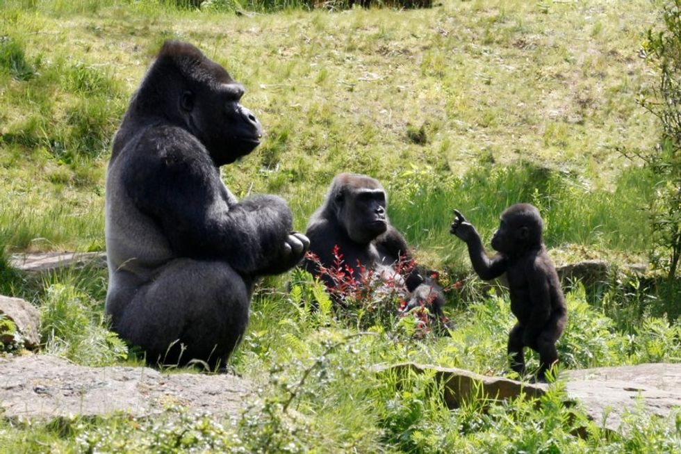 Gorillas are generally pretty chill.
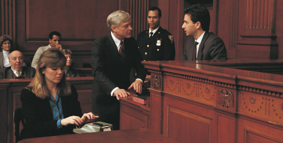 A court reporter taking notes.via
 Depiction of Jesus Christ in Heaven.via
 A photo of Santa Claus.via