In George Carlin’s now-infamous “Seven Words You Can Never Say on Television” bit from the stand-up comedian’s 1972 album, Class Clown, he lists seven profane words that were, at the time, banned from both American TV and radio. There’s no need to repeat them all here (please watch the YouTube video though; there’s a reason it’s a classic), but his point is, essentially, that words have no intrinsic value until we give them power. None of the seven words are innately wrong or bad, it’s nothing but a bunch of noises—yet the nature of censorship and society deems them inappropriate. He spends a little extra time on the infamous "F word," noting it's a "great word," a "nice word," even a "cute word, kind of."
Then, he sums it pretty concisely: "[It's an] easy word to say... Starts with a nice soft sound fuh ends with a kuh. Right? A little something for everyone.”
George Carlin performing "Seven Words You Can Never Say on Television."www.youtube.com
It does roll off the tongue, doesn’t it? And its perfectly tailored for when a finger gets slammed by a closing door, the moment your phone drops, face-down, on the pavement without a screen protector, and when walking out of a movie to find your car has been towed.
But we’re not supposed to utter those words. There are stories of teachers who would wash your mouth out with soap. Swear jars exist in more American office buildings than you'd think. For our entire lives, profanity has been branded as unprofessional, uncouth, and juvenile. However, science is now proving that a good ol' expletive might be good for you. Researchers are currently swearing by swearing, claiming that cuss words hold cathartic value as well as other physiological and social powers.
The psychological benefits are f*cking real
In June 2020, Dr. Richard Stephens and PhD researcher Olly Robertson published a study in Frontiers in Psychology that proved the connection between pain tolerance and swearing. The findings were astonishing. When participants swore during painful experiences—like submerging their hands in ice-cold water—their pain tolerance shot up 33% and they were able to tolerate the discomfort twice as long as those who didn’t swear or screamed out made-up words.
 Sometimes, "bad" language can actually be good. media2.giphy.com
Conventional swear words, like Carlin’s favorite four-letter one, work best when it comes to increased pain tolerance. This is called “analgesia,” which means the body reduces or completely erases the sensation of pain while conscious. If you’ve seen the film Novocaine, or even just the trailer, then you get the idea. However, interestingly, scientists aren’t in total agreement on why this phenomenon happens. The working theory? Swearing in distressful situations may activate the amygdala, triggering a fight-or-flight response that surges the body with adrenaline, a natural pain reliever.
“Swearing is such a common response to pain that there has to be an underlying reason why we do it,” says psychologist Richard Stephens of Keele University in England, who led the study, before adding, “I would advise people, if they hurt themselves, to swear.”
Holy sh*t, swearing makes you stronger
Studies also show that swearing can improve physical performance, especially during short, intense tasks. Scientists found that swearing can increase your performance in the gym, specifically in areas including grip strength, endurance exercises, push-ups, and even cycling. Why? Like Will Ferrell says in the movie Blades of Glory, “it gets the people going.”
So, the next time you’re struggling through that last rep at the gym, channel your inner Jerry West, and let the expletives fly.
Jerry "the Logo" West, doing what he does best: crashing out and cursing. www.youtube.com
Obscenities, the emotional superpower you never knew you had
Swearing works like an emotional valve, a spigot that can be turned on and unleashed whenever you feel overwhelmed, frustrated, hurt, or angry, and allows the strong emotions to pass through you quicker and easier. “Swearing allows us to vent and cope with emotions such as anger and frustration,” says Timothy Jay, psychology professor emeritus at Massachusetts College of Liberal Arts and author of Why We Curse (2008) and Cursing in America(2012).
Even road rage can be a good thing: in a 2018 study called “Get the f#∗k out of my way!” Exploring the cathartic effect of swear words in coping with driving anger,” scientists found that simply swearing while a pedestrian crosses the road illegally had a cathartic effect. They write, “These findings suggested that swearing is not only an expression of verbal aggression towards another road user, but occasionally a way to cope with anger, which leads to better outcomes for the driver such as more positive affect and lower physical activation.”
 Road rage can help release pent-up emotions, especially when they're valid. Photo credit: Canva
Swearing, the vulgar social glue holding it all together
Swearing, in the right context, can strengthen social ties. Something as simple as an expletive can convey a level of relatability, signaling that you’re not prudish.
According to Ben Bergen, a professor of cognitive science at the University of California, San Diego, and author of the 2016 book What the F: What Swearing Reveals About Language, Our Brains, and Ourselves:
“Some people believe that profanity can break social taboos in a
generally non-harmful way, [which] can create an informal environment in
which people feel like insiders together. Similarly, swearing can lead
others to believe that the person speaking is honest because they’re
saying what they really believe.” - Ben Bergen
In the cleverly titled 2017 study, "Frankly, We Do Give a Damn: The Relationship Between Profanity and Honesty," researchers found that profanity can be positively associated with honesty because of its associations with expressing unfiltered feelings and sincerity. Obviously, there’s a time and place for everything, so it's probably best to hold your tongue in formal settings, like a parent-teacher conference or meeting your partner's parents for the first time.
 Swearing is not morally wrong! Just take it from Bryan Cranston. media0.giphy.com
But, despite what we may have been told growing up, swearing is not morally wrong. So, the next time you drop your phone, face-down, and it does happen to be cracked, do the natural thing. Swear. Cuss. Curse the powers that may be. You might be doing yourself a favor.

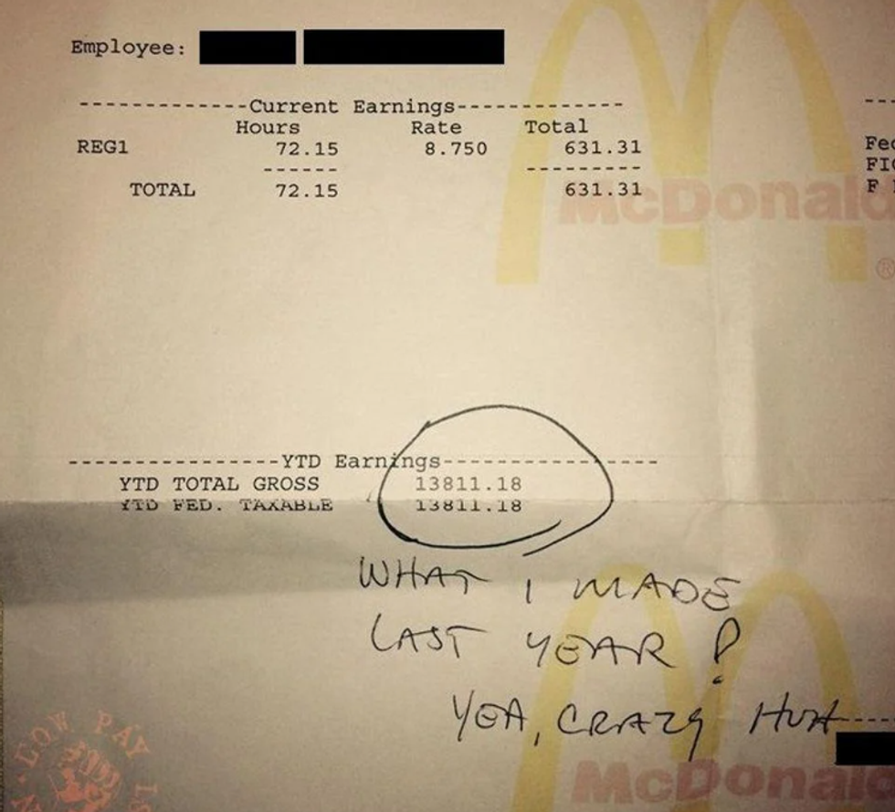 One year of work at McDonalds grossed this worker $13,811.18.via
 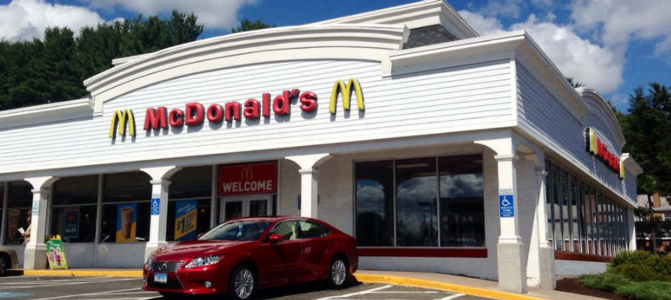 A photo of a McDonald's in Hartford, CT. via
  Sometimes, "bad" language can actually be good.
 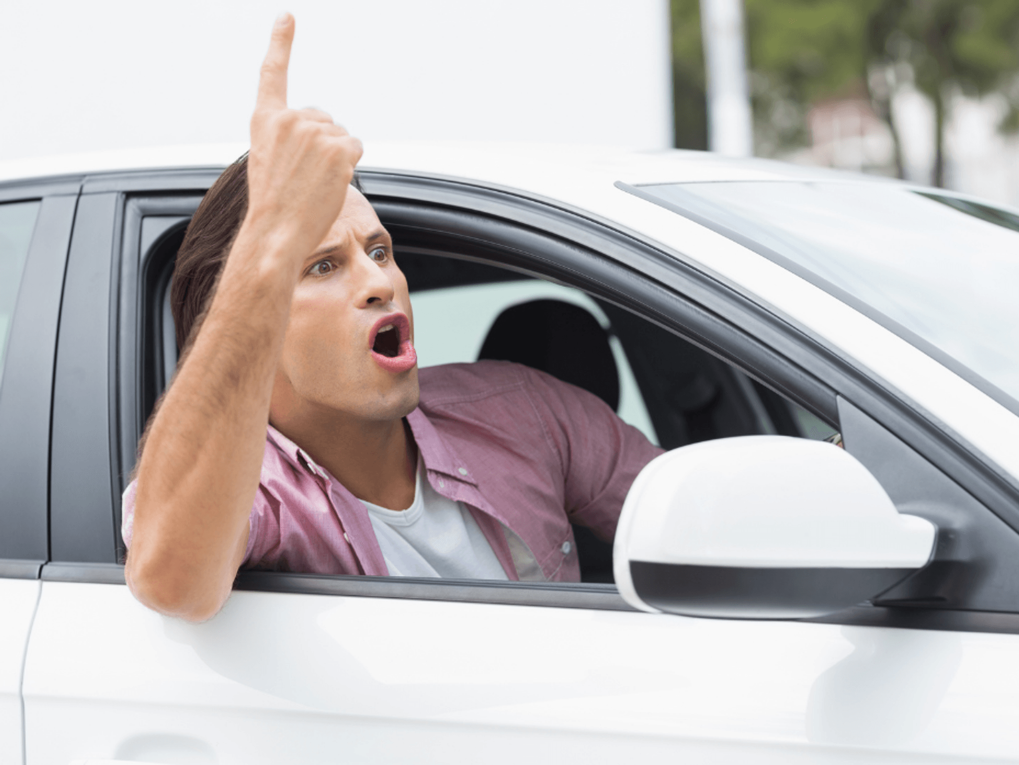 Road rage can help release pent-up emotions, especially when they're valid.
 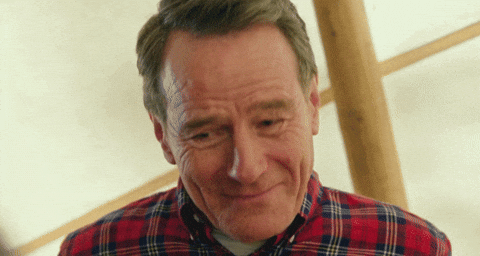 Swearing is not morally wrong! Just take it from Bryan Cranston.
  Vincent Van Gogh's Self-Portrait, 1889Image via
  Turbulent flow illustrated and animated.
 Animation of art referencing science.
 Animated Starry Night
 An animated depiction of The Scream.
 Bring It Reaction GIF by reactionseditor
There's a reason why some people can perfectly copy accents, and others can't