This Is The Most Depressing Version Of Google Maps I’ve Ever Seen

What do you get when you combine Google maps and a bunch of info about household income? Only one of the most fascinating things ever to happen because of the census.

Colder colors mean wealthier neighborhoods; warmer colors mean poorer ones. Whoever thought segregation could be this hypnotic, am I right? Here are some cities (US only):

Los Angeles, California:


Cleveland, Ohio:

Houston, Texas:

Washington, D.C.:

Detroit, Michigan:

Philadelphia, Pennsylvania:

Atlanta, Georgia:

Las Vegas, Nevada:

If you don’t see your city, check out Rich Blocks, Poor Blocks to find it.

Culture

Janet Jackson’s unique song made so many laptops crash that it became a cybersecurity case

Mental Health

Yale expert shares 5 steps to rewire your brain for happiness with no weird tricks

Generations

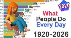
Video shows how people spent their time each day from 1920 to 2026. It’s eye-opening.

Parenting

A Memphis news anchor fell asleep on the air. Parents everywhere came to her defense.